New configurable content widgets allow administrators of the OnitX Unity experience to create customized, informative experiences for users without the need for custom HTML/CSS.
The new suite widgets are the:
- Action List widget: a row of titled action cards for shortcuts such as Matter & Task Management, Requests, or Dashboards & Reports.
- Greetings widget: offers a "welcome strip" at the top of a suite home, combining the logo, welcome line, and optional links.
- Link widget: a single destination card with a name, description, icon, and URL.
- Page Title widget: offers a simple page header for a dashboard section.
- Quick Link widget: a configurable FAQ or resource card grid that replaces portal HTML card layouts.
- Summary widget: a notice or message with optional header links and a collapsible body.
Our recommendation is to use the Action List, Greetings, Link, Page Title, Quick Link, and Summary widgets for new Unity UX landing content; use the Portal widget for one-off HTML and check the Hide in Unity checkbox when a Unity UX widget is ready to replace it.

Adding the New Widgets
- To add the new widgets to your experience, click Edit on your suite, then click Suite Widgets.
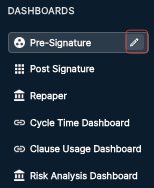
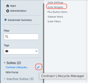
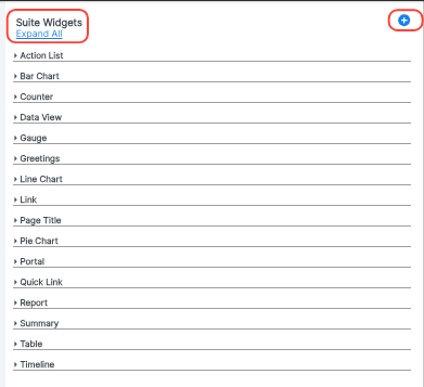
- The Suite Widgets section will open.
Here, you'll be able to see the existing suite widgets; click the Expand All button to see existing widgets.
Click the Plus button in the top-right corner of the screen to add widgets.
- Choose your desired widget from the Add Widgets menu.
Unity widgets are marked with a Unity tag.
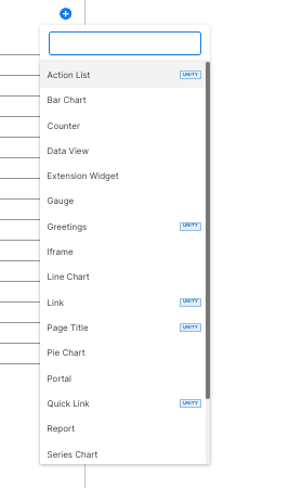
Here's a breakdown of the new suite widgets:
Action List Suite Widget
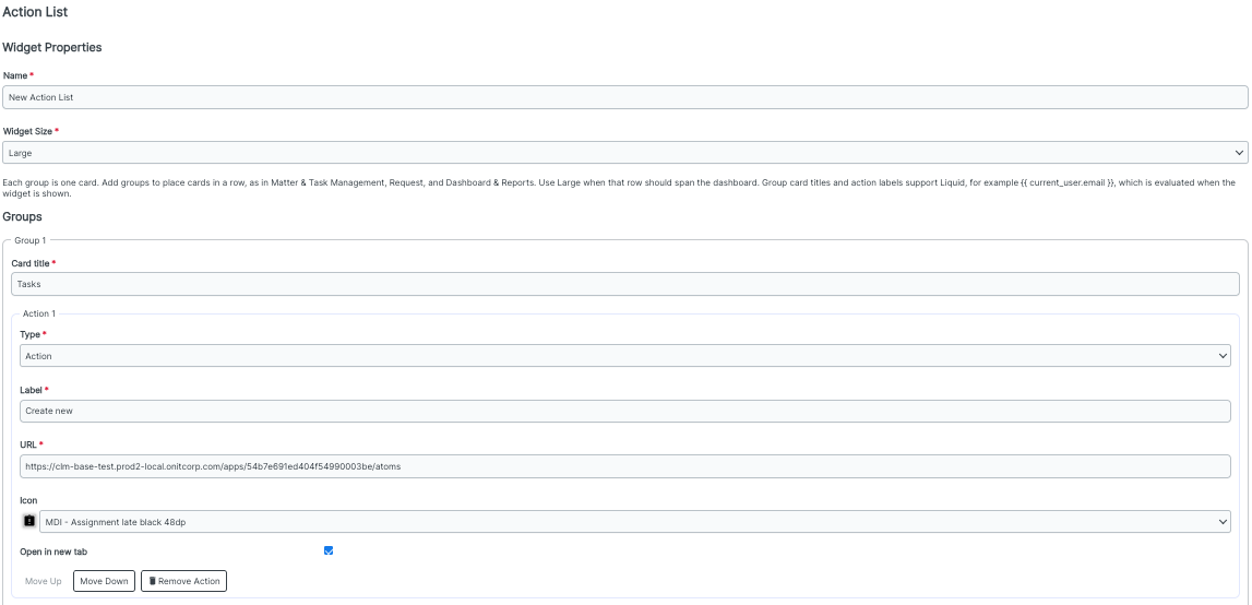
The Action List widget presents a row of titled action cards for shortcuts such as Matter & Task Management, Requests, or Dashboards & Reports. Use this for primary "do work" shortcuts on a suite home.
After clicking the Action List option in the Add Widgets menu, you'll get this Widget Properties menu. You can customize the:
- Name (required)
- Widget Size (required); choose from Small, Medium, or Large
- Under Groups, you can choose the:
- Card Title (required)
- Type (drop-down menu, required); choose from Action or Widget
- Label (required)
- URL (required)
- Icon (drop-down menu)
Open in a new tab (check box)
Use the Move Up and Move Down buttons to move the groups up or down in the order; click the Add Action and Remove Action buttons to add or remove actions. Click Add Group to add a new group.

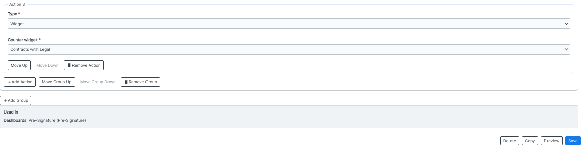
The bottom of the page will show where the Action List is used. Click Delete to delete the Action List, Copy to copy the Action List, Preview to preview the Action List, or Save to save the Action List.
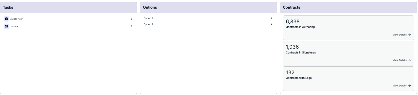
Here's an example of what the Action List widget can look like within OnitX:
Greetings Suite Widget
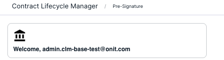
The Greetings widget is a welcome strip at the top of a suite home, combining a logo, welcome line, and optional links.
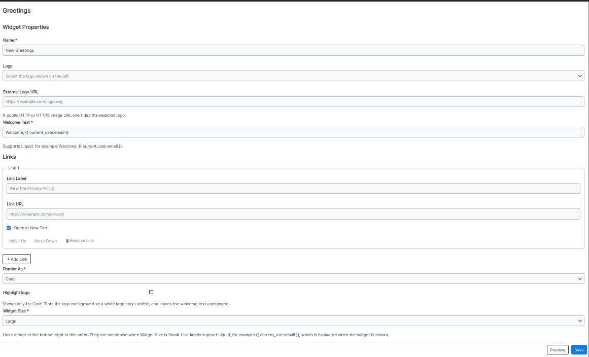
After clicking the Greetings option in the Add Widgets menu, you'll get this Widget Properties menu. You can customize the:
- Name (required)
- Logo (drop-down menu)
- External logo URL; note that a public image URL overrides the selected logo
- Welcome Text (required); note that this field supports Liquid additions
- Link information (optional): Link Label, Link URL, and the Open in a new tab check box; use the Move Up and Move Down buttons to customize the link order, the Remove Link button to remove the link, and the Add Link button to add another link
- Render As option (drop-down menu); choose from Card or Without Card
- Highlight Logo (for a Card only); this tints the logo background so a white logo stays visible, and it does not affect the welcome text
Widget Size (required); choose from Small, Medium, or Large.
Click Save to save the widget and Preview to preview what the widget will look like.
Here's an example of what the Greetings widget can look like within OnitX:
Link Suite Widget
The Link widget is a single destination card with a name, description, icon, and URL. Use this to highlight a single destination when a full Quick Link grid isn't needed.
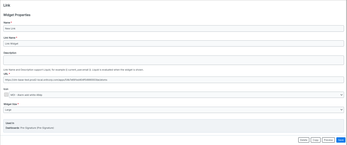
After clicking the Link option in the Add Widgets menu, you'll get this Widget Properties menu. You can customize the:
- Name (required)
- Link Name (required)
- Description
- URL (required)
- Icon (drop-down menu)
Widget Size (drop-down menu); choose from Small, Medium, or Large
Note that the Link Name and Description will support Liquid. The bottom of the screen will show you where the widget is used. Click Delete to delete the widget, Copy to copy the widget, Preview to preview the widget, or Save to save the widget.
Here's an example of what the Link widget can look like within OnitX:

Page Title Suite Widget
The Page Title widget offers a simple page header for a dashboard section. Use this for section headers above rows of widgets, such as "FAQ and Support" or "Getting Started."
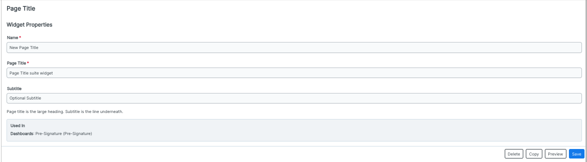
After clicking the Page Title option in the Add Widgets menu, you'll get this Widget Properties menu. You can customize the:
- Name (required)
- Page Title (required)
Subtitle
The bottom of the screen will show you where the widget is used. Click Delete to delete the widget, Copy to copy the widget, Preview to preview the widget, or Save to save the widget.
Here's an example of what the Page Title widget can look like within OnitX:

Quick Link Suite Widget
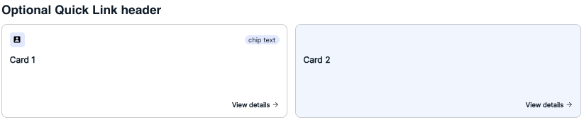
The Quick Link widget is a configurable FAQ or resource card grid that replaces portal HTML card layouts. Use this for Portal FAQ tiles, such as Access, User Guide, or Support.
After clicking the Quick Link option in the Add Widgets menu, you'll get this Widget Properties menu. You can customize the:
- Name (required)
- Heading
- Description
- On each Card, you can customize the:
- Title (required)
- Description
- URL (required)
- Icon
- Chip Text
- Chip Style (drop-down menu); choose from Default or Primary
- Action Label
- Highlighted background and Open in a new tab (check boxes)
Use the Move Up and Move Down buttons to move the cards up or down; use the Remove Card button to remove the card. Note that the heading, description, and each card's title, description, and chip text support Liquid.
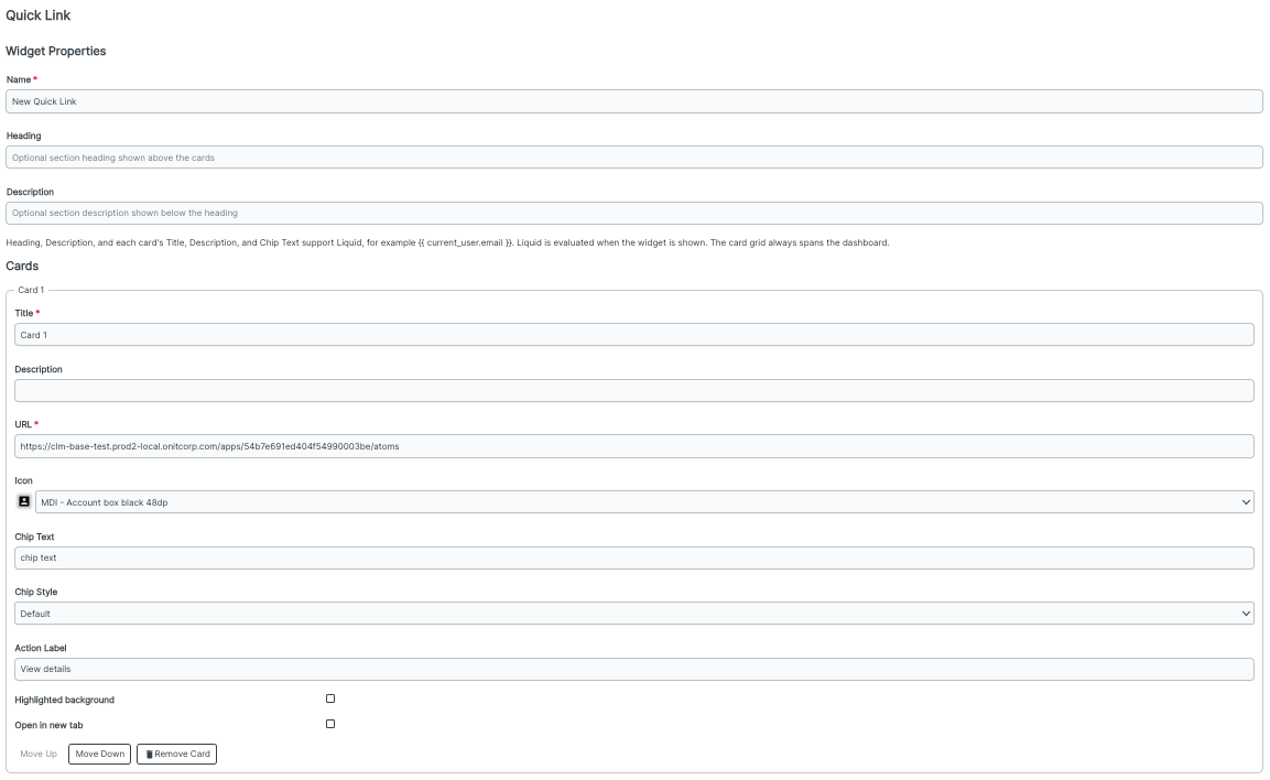
Click the Add Card button to add a new card. The bottom of the page will show where the widget is used. Click Delete to delete the widget, Copy to copy the widget, Preview to preview the widget, or Save to save the widget.

Here's an example of what the Quick Link widget can look like within OnitX; note that the card on the left has a highlighted background, while the card on the right does not.
Summary Suite Widget
The Summary widget provides a notice or message with optional header links and a collapsible body. Use this for things like legal or jurisdiction notices or policy summaries with FAQ or privacy links.
After clicking the Summary option in the Add Widgets menu, you'll get this Widget Properties menu. You can customize the:
- Name (required)
- Title
- Message (required); use the formatting and Source options at the top of the field to customize the message.
- The Show Collapsible check box, which lets users expand or collapse the message while the title and links remain visible
- On the Links, you can customize:
- The Label
- The URL
- Open in a new tab (check box)
Use the Move Up and Move Down buttons to move the links up or down; use the Remove Link option to remove the link. Click Add Link to add a new link.
The bottom of the screen will show you where the widget is used. Click Delete to delete the widget, Copy to copy the widget, Preview to preview the widget, or Save to save the widget.
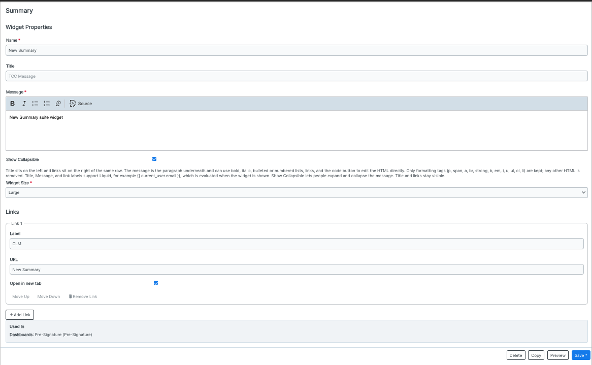
Here's an example of what the Summary widget can look like within OnitX:
