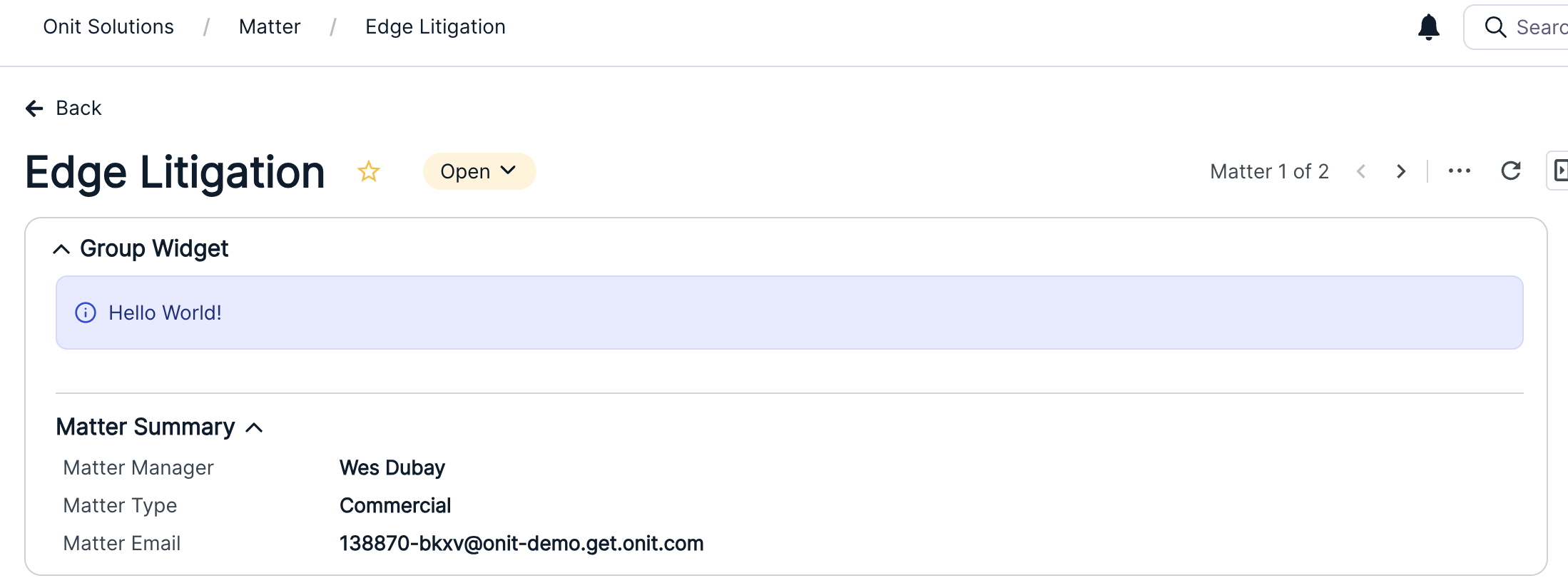
Onit's November 2026 release features updated Unity components for Contract Lifecycle Management (CLM) and Legal Service Requests, giving users a more consistent view of progress, hierarchies, lifecycle metrics, and in-product status messages.
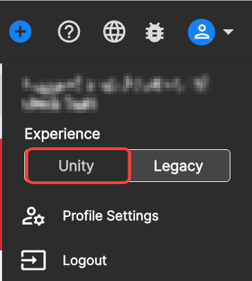
To view the new Unity experience, use top-right main profile menu to switch from Legacy to Unity.
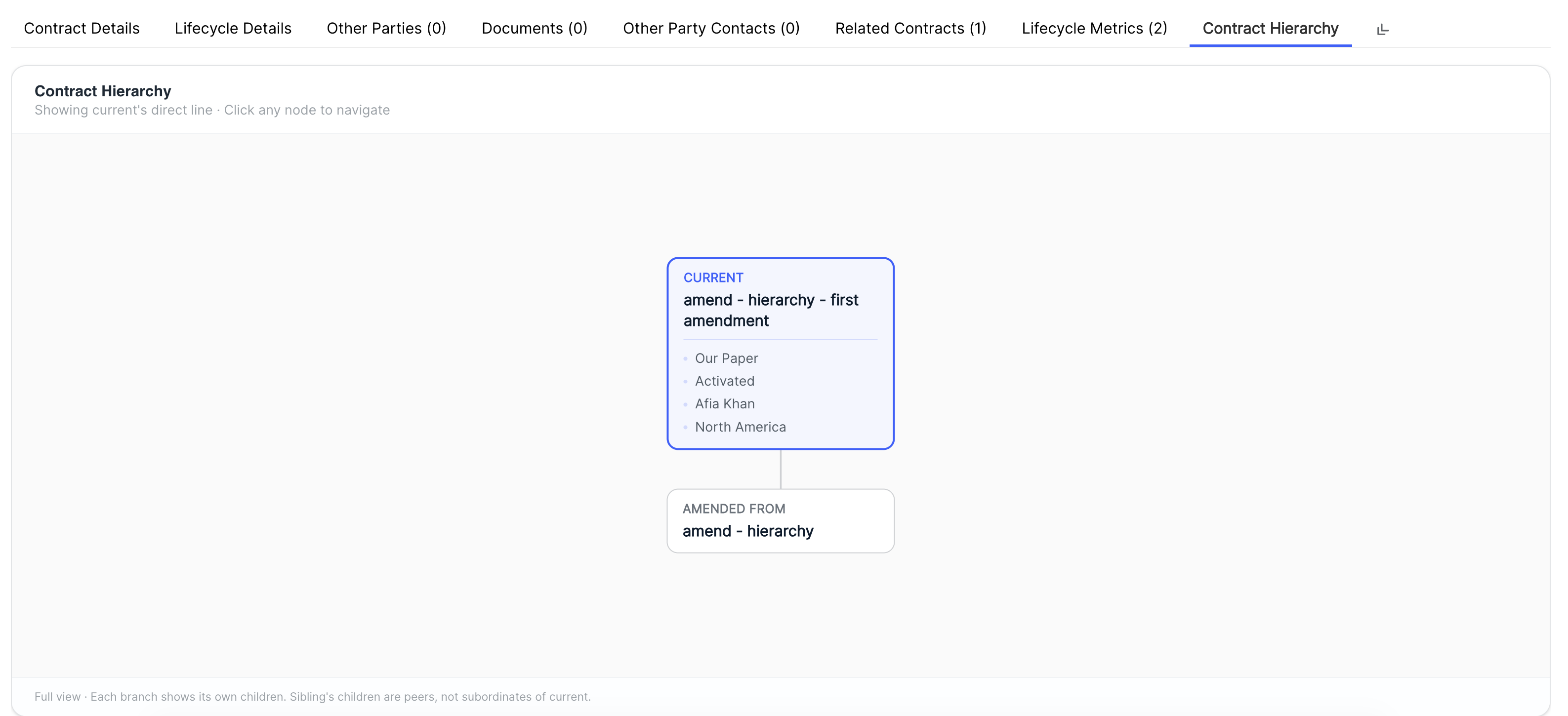
Users can also click on the Hierarchy tabs within a contract to view a chart of essential hierarchies; these include Contract Hierarchy, Entity Hierarchy, and Other Party Contracts.
Here's an example of the Contract Hierarchy tab:
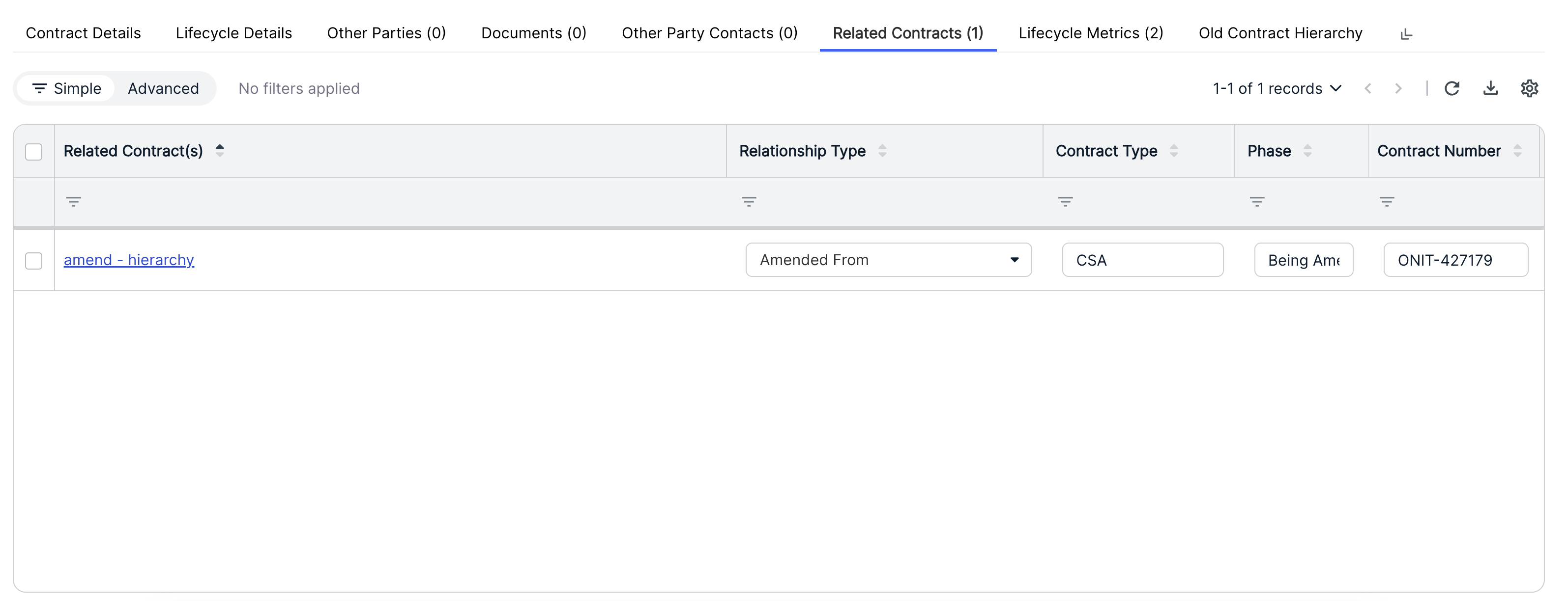
Use the Related Contracts tab to explore any related contracts. Note that this continues the example detailed above; the entity and other party applications would have a different tab name.
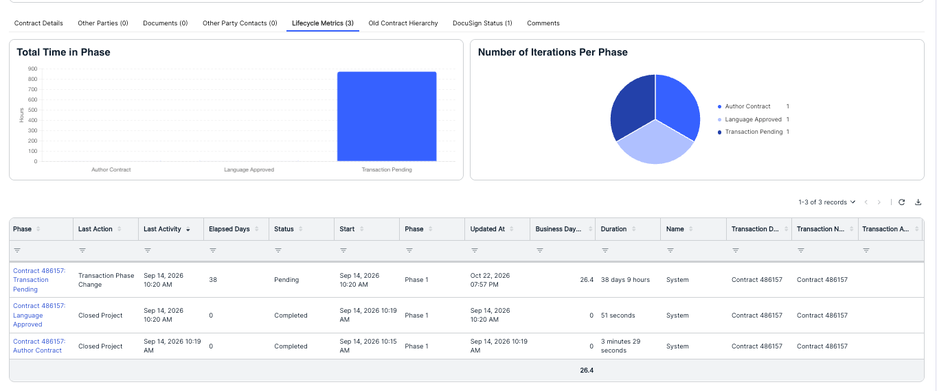
Users can also click on the Lifecycle Metrics tab to view key phase metrics.
Additionally, the November 2026 release introduces several App Widgets, allowing you to put the most important information and actions front-and-center for users. These options include:
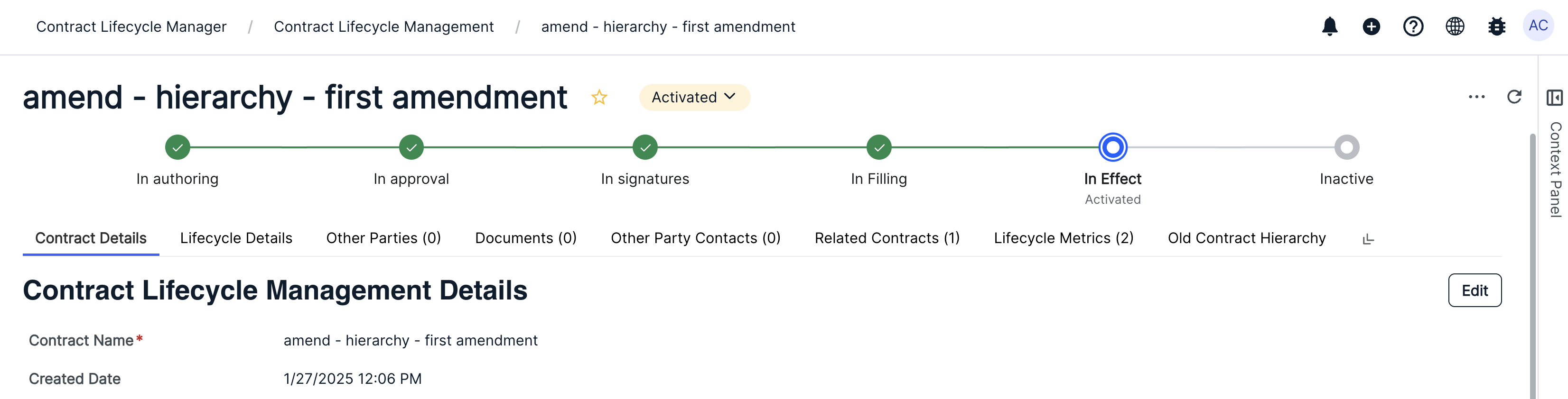
- Phase Widgets show a clear progress tracker of where a record is in its lifecycle. Groups many detailed workflow steps into a few easy-to-follow stages, such as Intake, Review, Negotiation and Signature. Finished stages show a green check, the current stage is highlighted and shows the exact step, and upcoming stages appear in grey.
- Custom Toast Widgets show short, timely alerts above the tabs on a record, such as "Document is processing," "Signature complete" or "Extraction failed." Alerts come in three color-coded styles with icons: Complete (green), Processing (orange) and Fail (red). An alert can include an Open button that takes users to a related page or document. Alerts close on their own after a short time and can also be closed manually. Several alerts can appear at once, each only when it applies.
Liquid Table Widgets show related information in a simple table, such as contacts, negotiation history or line items. Columns can be plain text or clickable links that open in a new tab. When there's nothing to display, the table shows a custom message.
Group Widgets combine several Summary, Message, Quick Link and Liquid Table widgets into one collapsible section, such as "Matter Overview." Each group holds an optional main widget at the top plus up to 20 additional widgets. Each part can start collapsed or expanded, which keeps busy records tidy. Anything that doesn't apply to the current record is hidden automatically.
Please refer to the Feature Spotlight: New App Widgets (September 2026) article for more information on previously released widgets (Message, Summary, and Quick Link).
Here's how to add the new widgets:
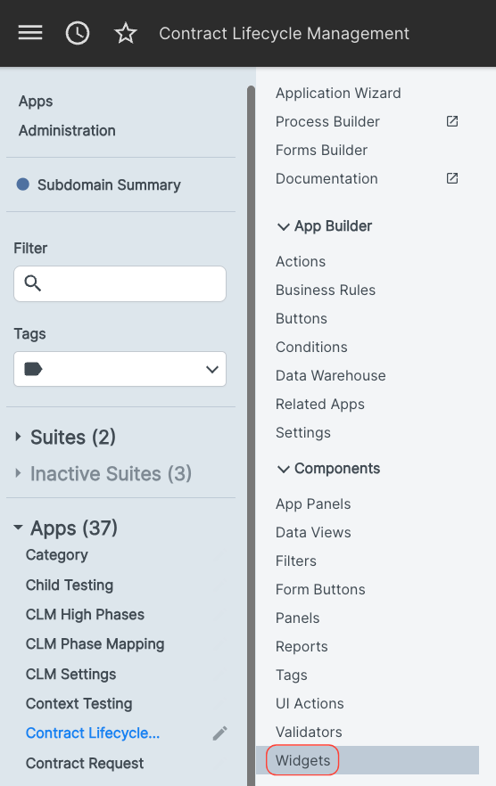
- Within the "Components" section of App Builder, select the "Widgets" option.
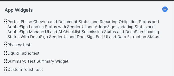
- The App Widgets screen will appear.
You'll see the existing widgets on this screen.
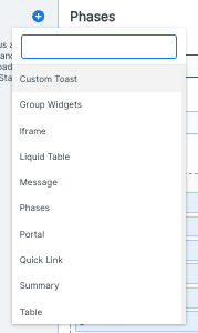
- Click the blue Add (plus) button to add a new widget.
The Custom Toast, Group Widgets, Liquid Table, and Phases widgets will be in the widget drop-down menu.
Here's a breakdown of the new widgets:
Phase Widgets
Phase Widgets show a clear progress tracker of where a record is in its lifecycle. Groups many detailed workflow steps into a few easy-to-follow stages, such as Intake, Review, Negotiation and Signature. Finished stages show a green check, the current stage is highlighted and shows the exact step, and upcoming stages appear in grey.
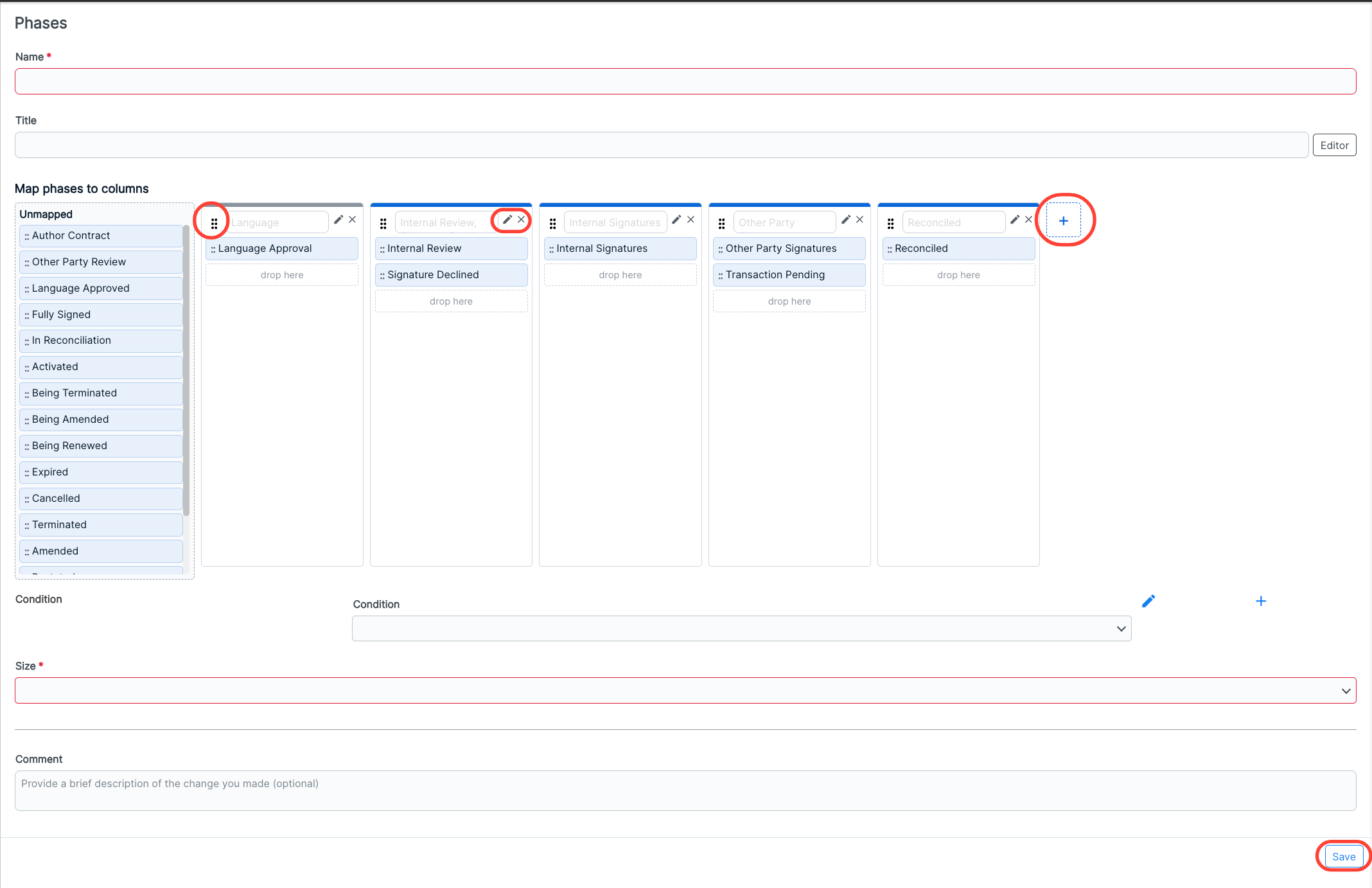
When you click on the Phases selection after clicking on the Add App Widgets button, you'll see the following screen. You can fill out the:
- Name (required)
- Title
- Map phases to columns: Move the Unmapped phases to the desired column. You can use the "dot" sections next to each phase or column to move them; use the X symbol to remove a column or the Edit (pencil) symbol to open the liquid editor. Use the Plus sign to add a column.
- Condition - Click the Add (plus) button to add another condition
Size (required) (Small, Medium, Large)
Any Comment you want to add (for example, to add detail on any additions or changes made to the widget)
Click Save to save your Phase Widget.
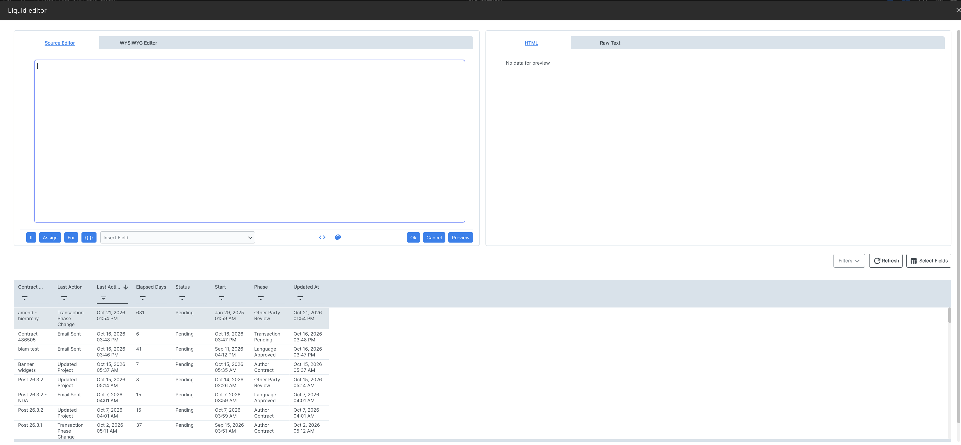
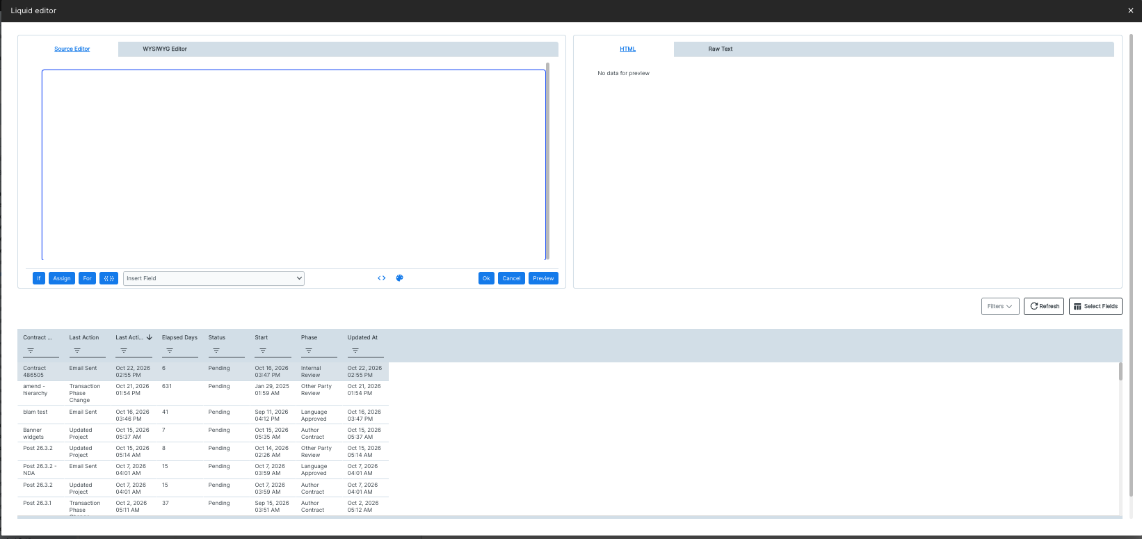
Click the Editor button on select fields to open the Liquid Editor console.
Here's what the Phase widget looks like in the Unity environment:
Custom Toast Widgets
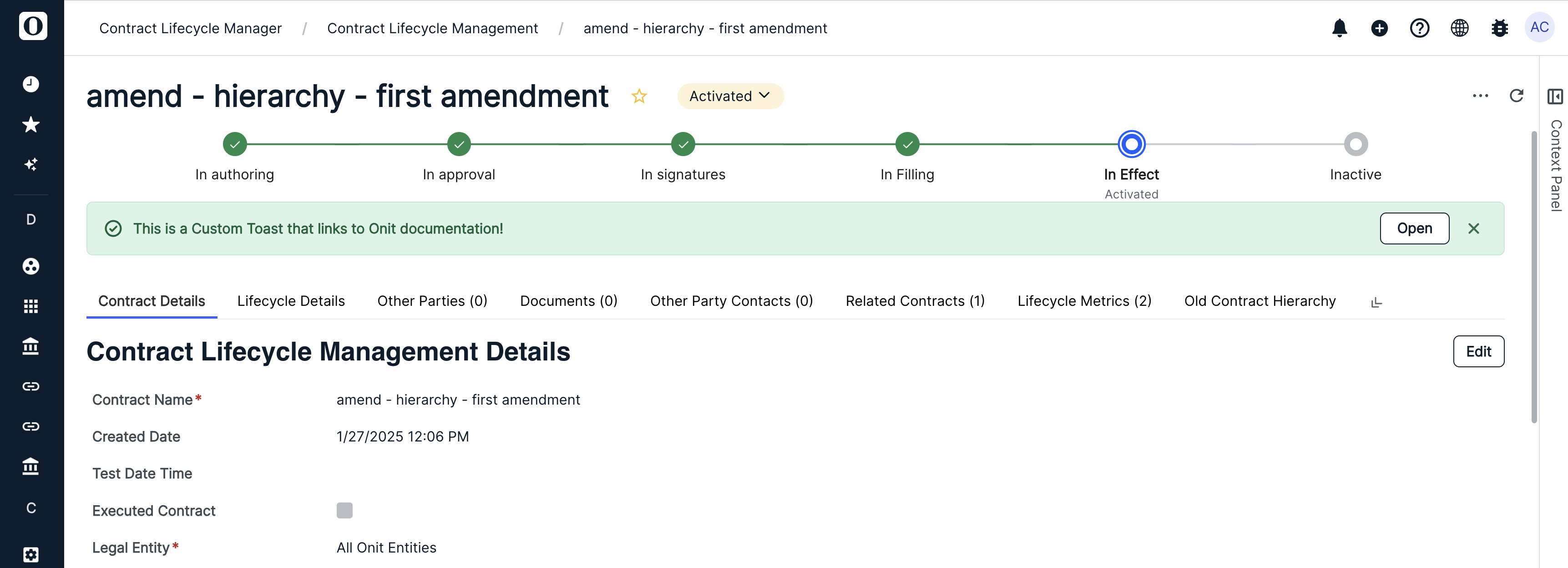
Custom Toast Widgets show short, timely alerts above the tabs on a record, such as "Document is processing," "Signature complete" or "Extraction failed." Alerts come in three color-coded styles with icons: Complete (green), Processing (orange) and Fail (red). An alert can include an Open button that takes users to a related page or document. Alerts close on their own after a short time and can also be closed manually. Several alerts can appear at once, each only when it applies.
When you click on the Custom Toast selection after clicking on the Add App Widgets button, you'll see the following screen. You can fill out the:
- Name (required)
- Shared Liquid
- Condition, Message, Link, and Format - Click Editor to open the liquid editor; click the Add (plus) button to add another condition.
Size (required) (Small, Medium, Large)
Any Comment you want to add (for example, to add detail on any additions or changes made to the widget)
Click Save to save your Custom Toast Widget.
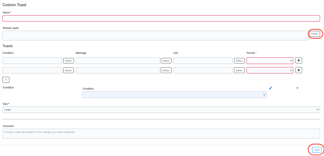
Click the Editor button on select fields to open the Liquid Editor console on the widgets.
Here's what the Custom Toast widget looks like in the Unity environment:
Liquid Table Widgets
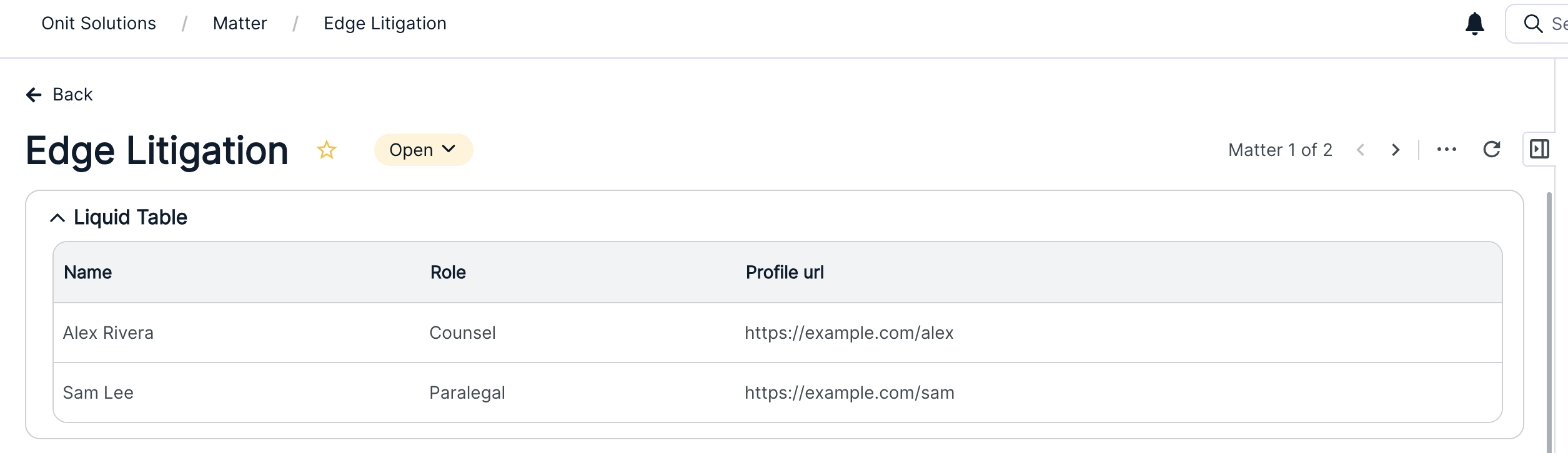
Liquid Table Widgets show related information in a simple table, such as contacts, negotiation history or line items. Columns can be plain text or clickable links that open in a new tab. When there's nothing to display, the table shows a custom message.
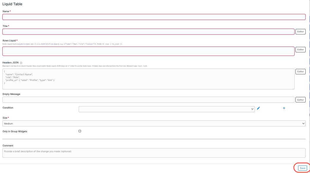
When you click on the Liquid Table selection after clicking on the Add App Widgets button, you'll see the following screen. You can fill out the:
- Name (required)
- Title (required)
- Rows Liquid (required)
- Headers JSON
- Empty Message
Condition - Click the Add (plus) button to add another condition
Size (required) (Small, Medium, Large)
Whether you want the liquid table widget Only in Group Widgets (check box)
Any Comment you want to add (for example, to add detail on any additions or changes made to the widget)
Click Save to save your Liquid Table Widget.
Here's what the Liquid Table widget looks like in Unity:
Group Widgets
Group Widgets combine several Summary, Message, Quick Link and Liquid Table widgets into one collapsible section, such as "Matter Overview." Each group holds an optional main widget at the top plus up to 20 additional widgets. Each part can start collapsed or expanded, which keeps busy records tidy. Anything that doesn't apply to the current record is hidden automatically.
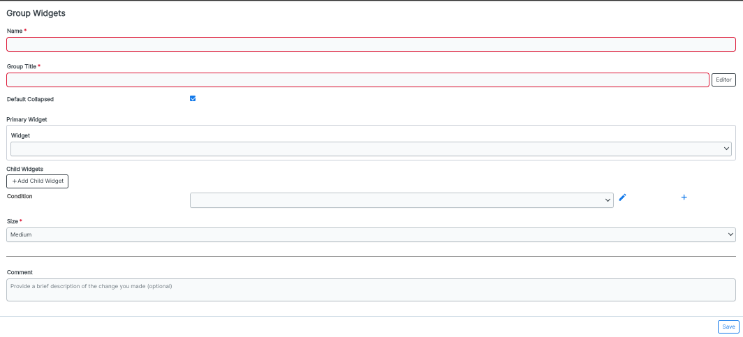
When you click on the Group Widgets selection after clicking on the Add App Widgets button, you'll see the following screen. You can fill out the:
- Name (required)
- Group Title (required)
- Default Collapsed check box - Check this to default the group to a "collapsed" state
- Primary Widget - Choose the primary widget from the drop-down menu
- Child Widgets - Click +Add Child Widget to add child widgets to the group
Condition - Click the Add (plus) button to add another condition
Size (required) (Small, Medium, Large)
Any Comment you want to add (for example, to add detail on any additions or changes made to the widget)
Click Save to save your Group Widget.
Here's what the Group Widget looks like in Unity: