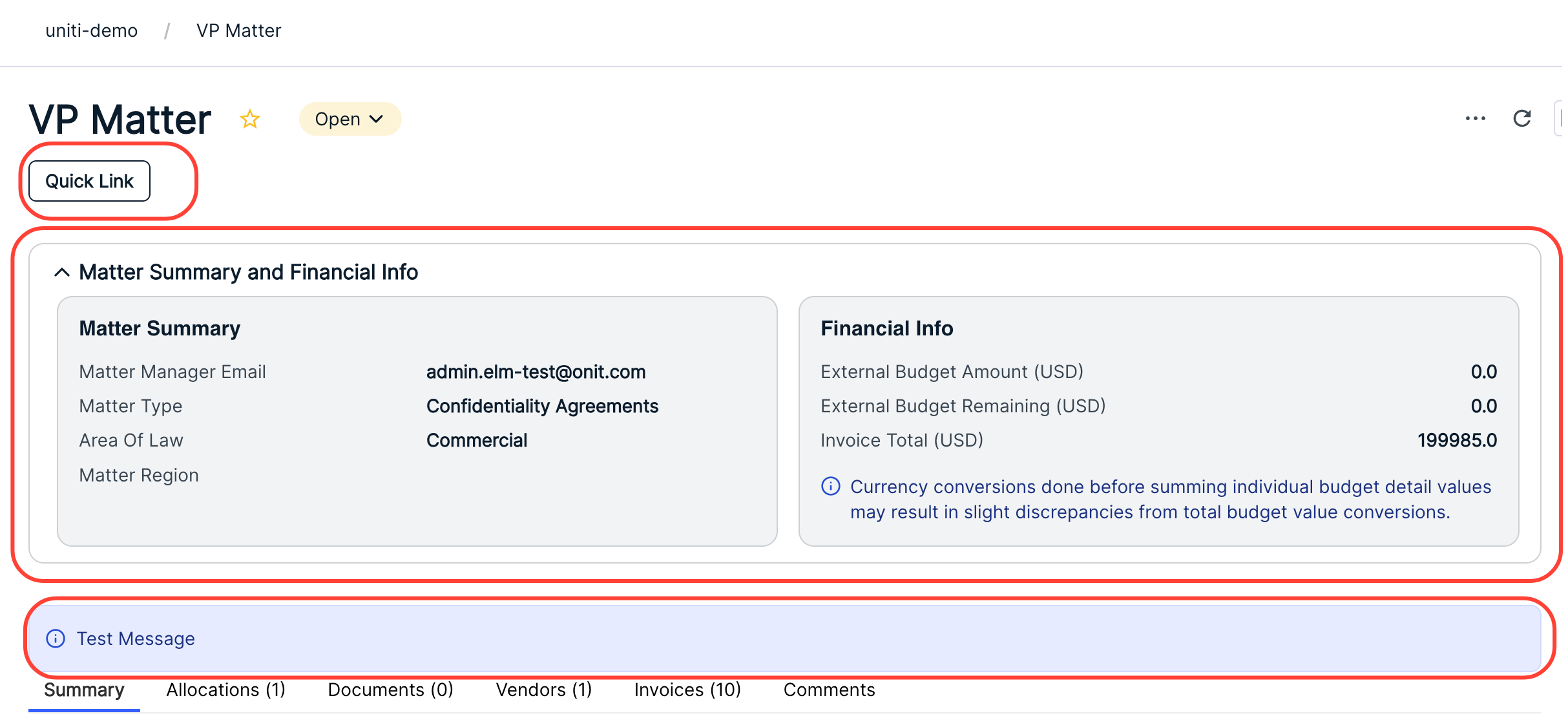
The September 2026 release introduces three new App Widgets to provide a consistent look and feel across the platform, all while still providing configuration options to meet specific use cases.
App widgets display above forms on record pages.
The three new widgets are:
- Summary Widget: Provides a high-level overview. You can configure up to two sections, each with its own section title, key fields, and message.
- Message Widget: A dedicated widget for displaying text with five message type options to convey additional meaning and follow Unity design principles.
- Quick Link Widget: Streamlines navigation by providing direct links to internal (Unity Apps, OnitX Apps and Suites) or external destinations. The widget dynamically updates its configuration options based on the selected destination and uses standardized Unity button formats.
Here's how to add the new widgets:
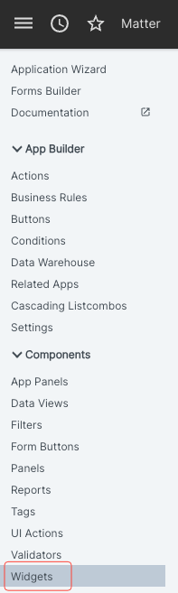
- Within the "Components" section of App Builder, select the "Widgets" option.
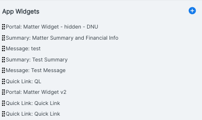
- The App Widgets screen will appear.
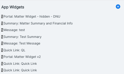
You'll see the existing widgets on this screen.
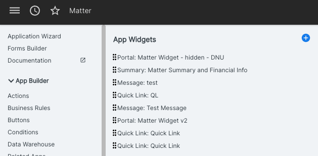
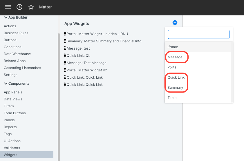
- Click the blue Add (plus) button to add a new widget.
The Message, Quick Link, and Summary widgets will be in the widget drop-down list.
Message Widget
The Message Widget is a dedicated tool for displaying important text or alerts, ensuring that critical information (like warnings, instructions, or success confirmations) is visually distinct and follows Unity design principles.
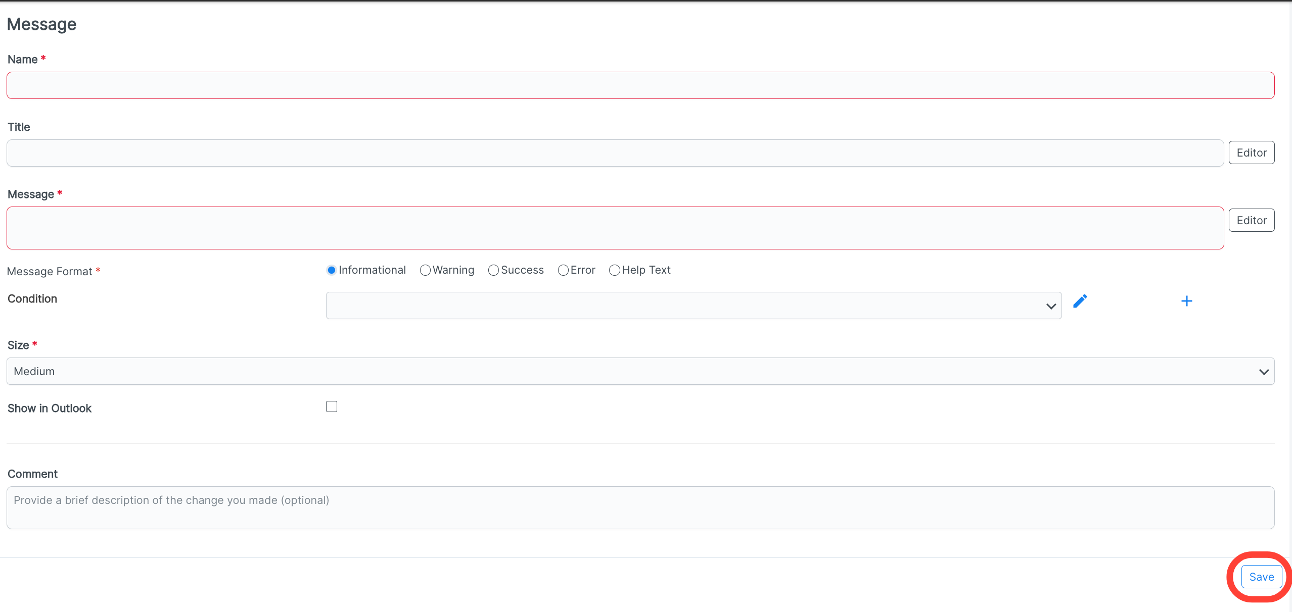
When you click on the Message selection after clicking on the Add App Widgets button, you'll see the following screen.
You can fill out the:
Name (required)
Title
Message (required)
Message Format (required) - You can choose from:
Informational: General updates or context. This features blue color-coding.
Success: Confirmation of a completed action. This features green color-coding
Warning: Alerts about potential issues. This features yellow color-coding
Error: Critical failures or blockers. This features red color-coding
Help: Guidance or tooltips for the user. This features neutral color-coding
Condition - Click the Add (plus) button to add another condition
Size (required) (Small, Medium, Large)
If you want to Show in Outlook (check box)
Any Comment you want to add
Click Save to save your Message Widget.
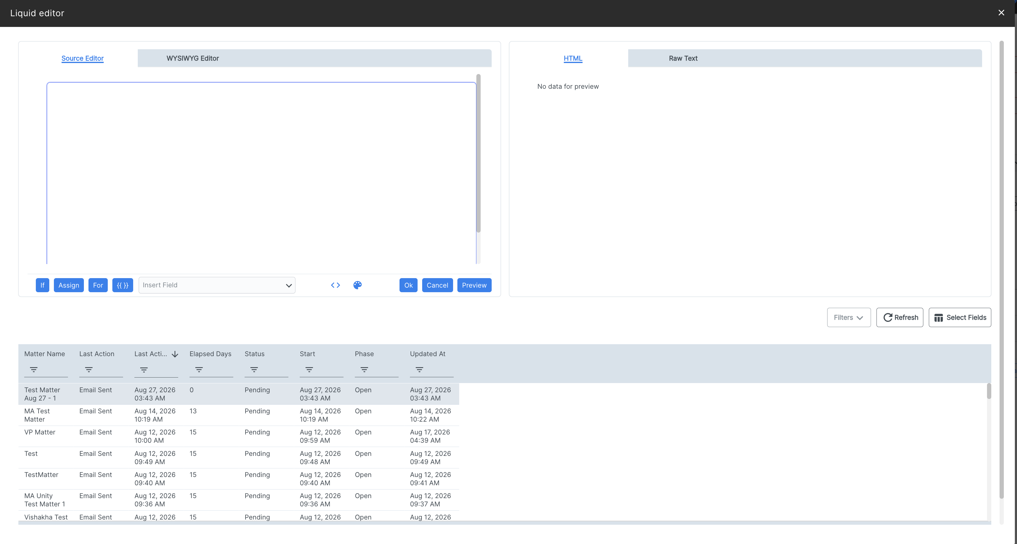
Click the Editor button on select fields to open the Liquid Editor console.
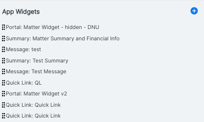
After clicking Save, the new Message Widget will appear in the main Widget directory.
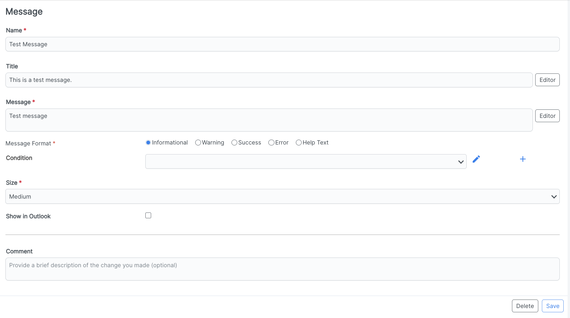
Here's what a new message widget would look like within an app:
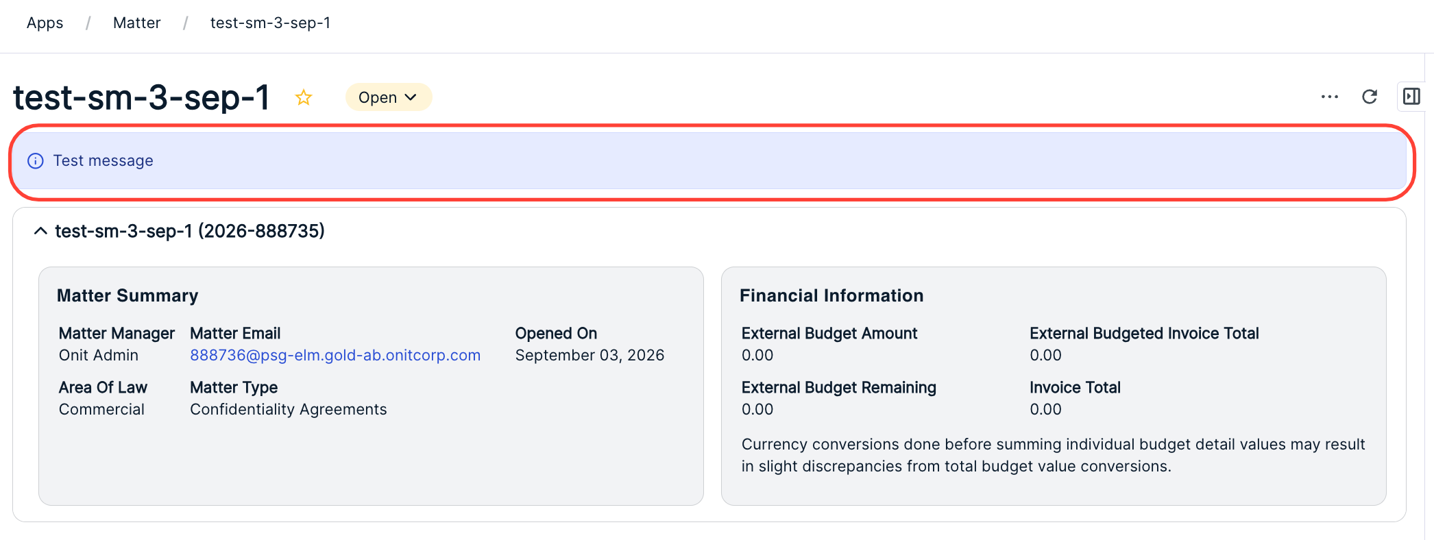
Quick Link Widget
The Quick Link Widget streamlines navigation by providing direct access to other resources, placing standardized Unity buttons at the top of a page to help users jump to related tasks or external sites quickly.
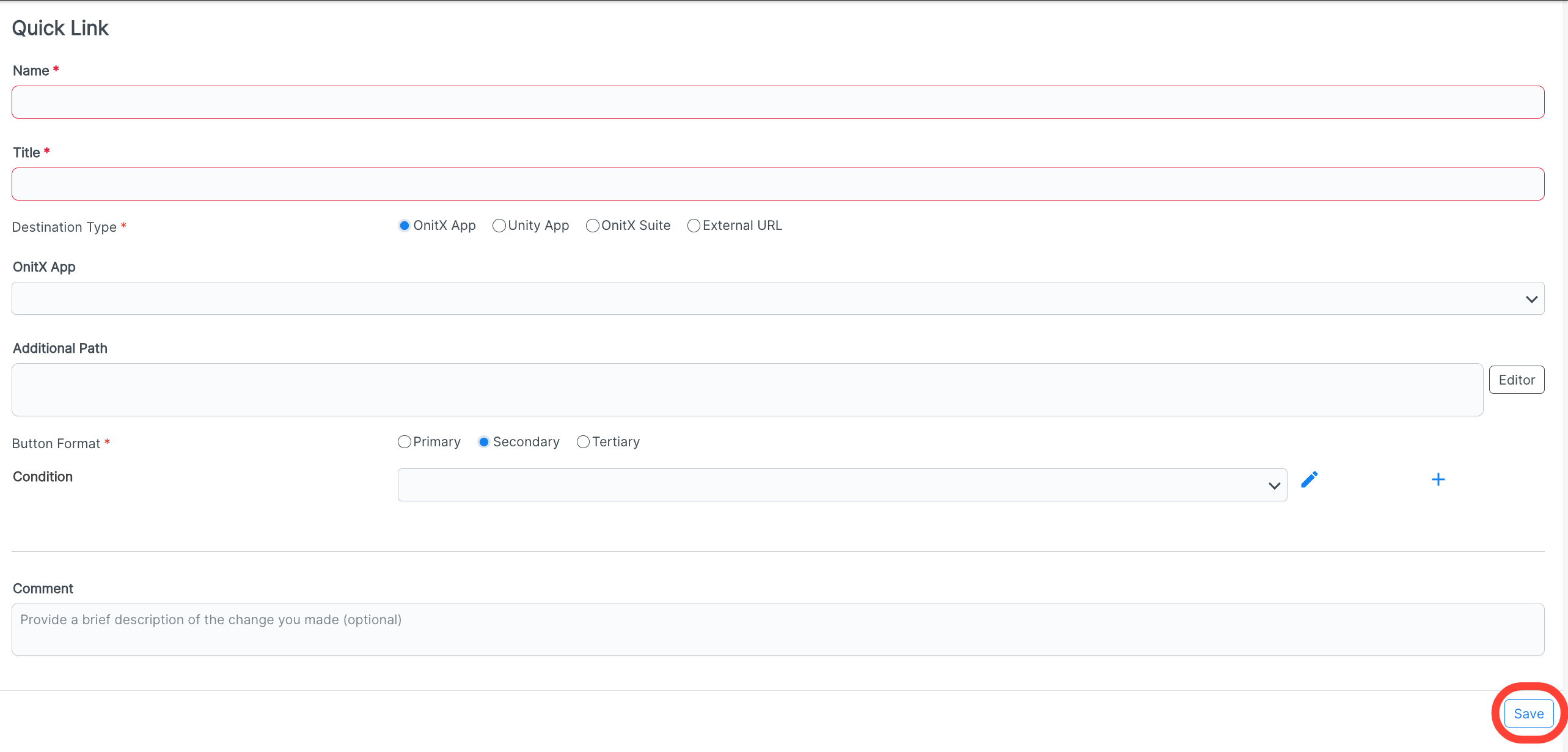
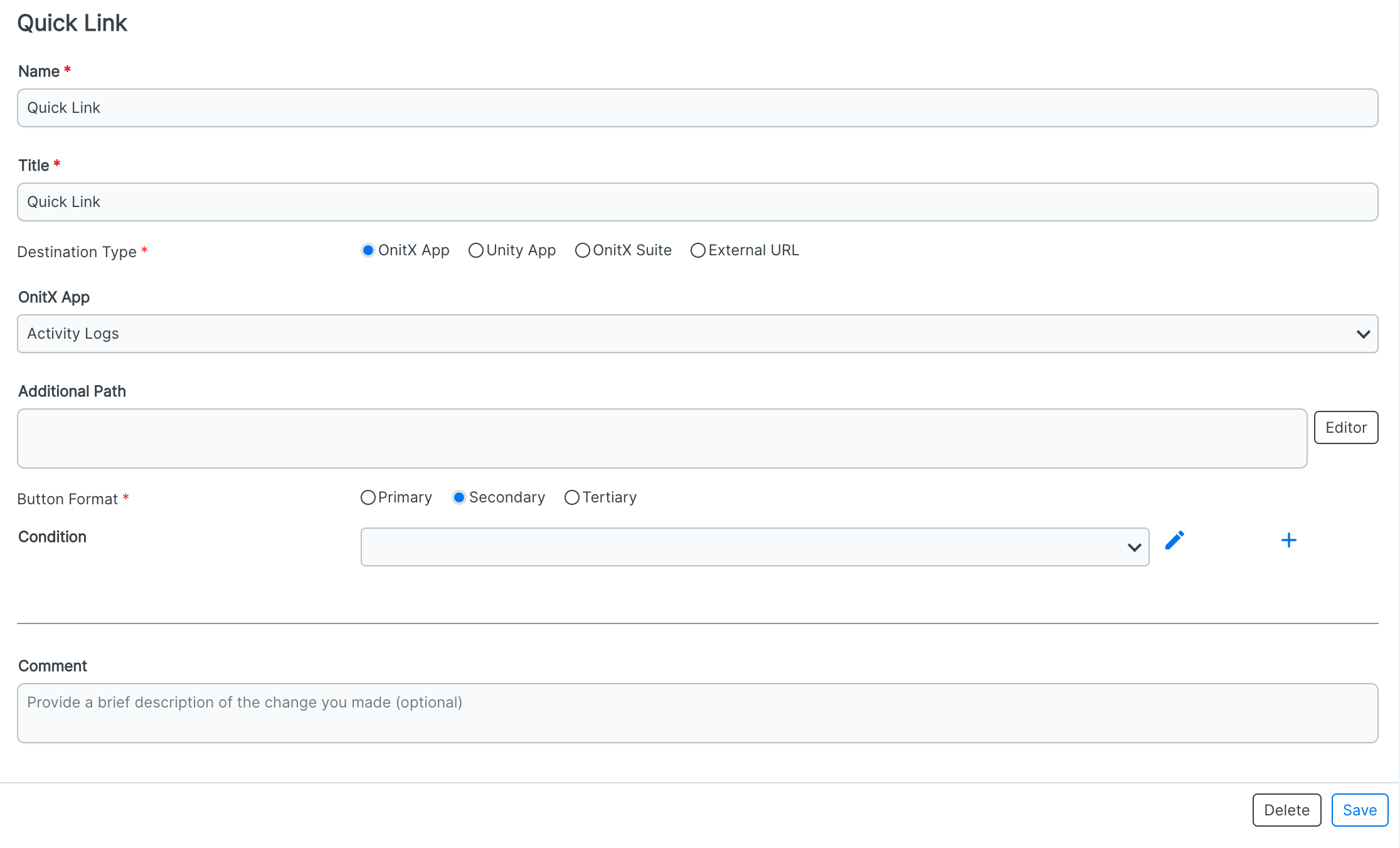
When you click on the Quick Link selection after clicking on the Add App Widgets button, you'll see the following screen.
You can fill out the:
Name (required)
Title (required)
Destination Type (required) (OnitX App, Unity App, OnitX Suite, External URL)
OnitX App (drop-down menu) - Note that this dynamically changes based on destination type selection.
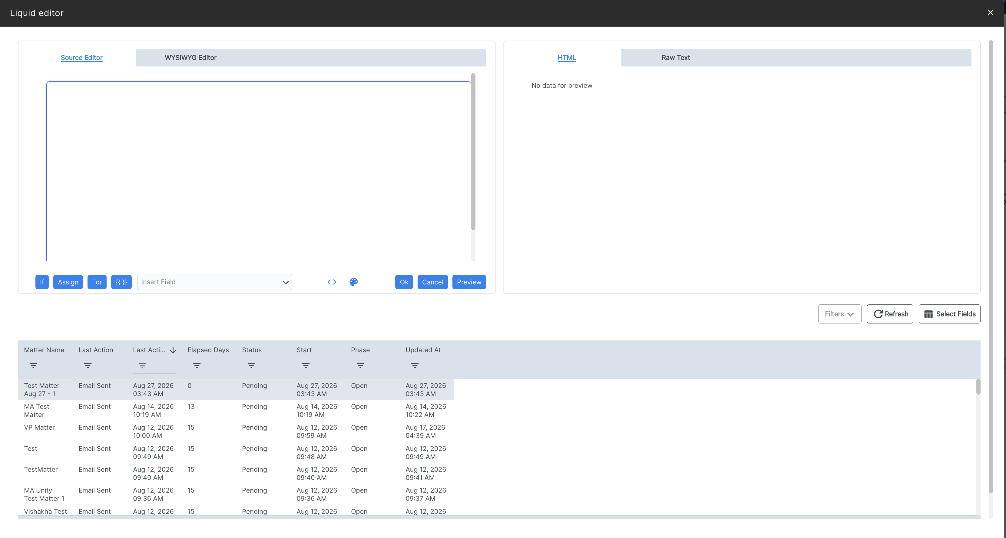
Additional Path - Using Liquid, this allows for the navigation to a specific record in the app selected.
Button Format (required)(Primary, Secondary, Tertiary)
Condition - Click the Add (plus) button to add another condition
Any Comment you want to add
Click Save to save your Quick Link.
Click the Editor button on select fields to open the Liquid Editor console.
After clicking Save, the new Quick Link widget will appear in the main Widget directory.
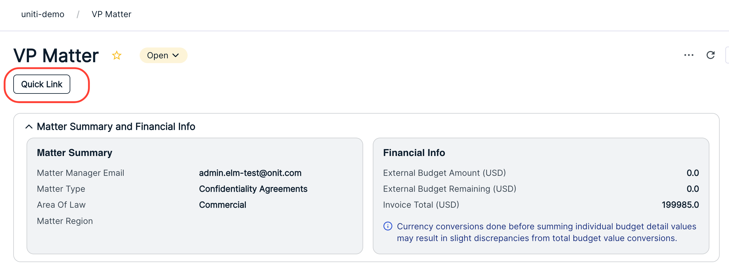
Here's what a new Quick Link widget would look like within an app:
Summary Widget
The Summary Widget provides a high-level overview of key data at a glance. Use it as a dashboard-style header for record pages, summarizing critical information so users don't have to dig through tabs.
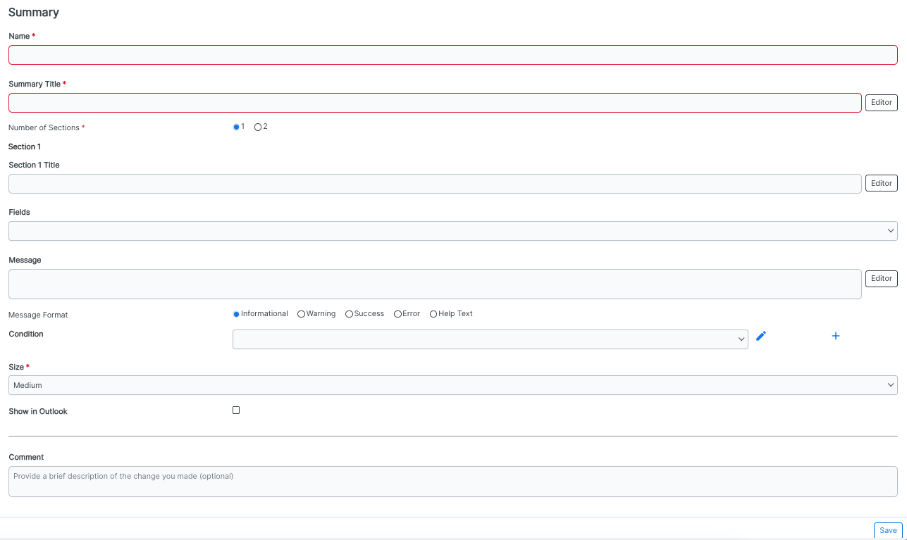
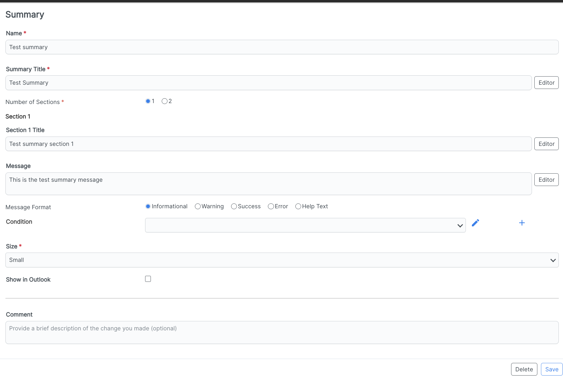
When you click on the Summary selection after clicking on the Add App Widgets button, you'll see the following screen.
You can fill out the:
Summary Name (required)
Summary Title (required)
Number of Sections (1 or 2)(required) - Note that if you select two sections, the form will dynamically show another section with the same fields.
Section X Title
Fields (drop-down menu)
The Message
The Message Format (Informational, Warning, Success, Error, Help Text)
Condition - Click the Add (plus) button to add another condition
Size (required) (Small, Medium, or Large)
If you want to Show in Outlook (check box)
Any Comment you want to add
Click Save to save your Summary widget.
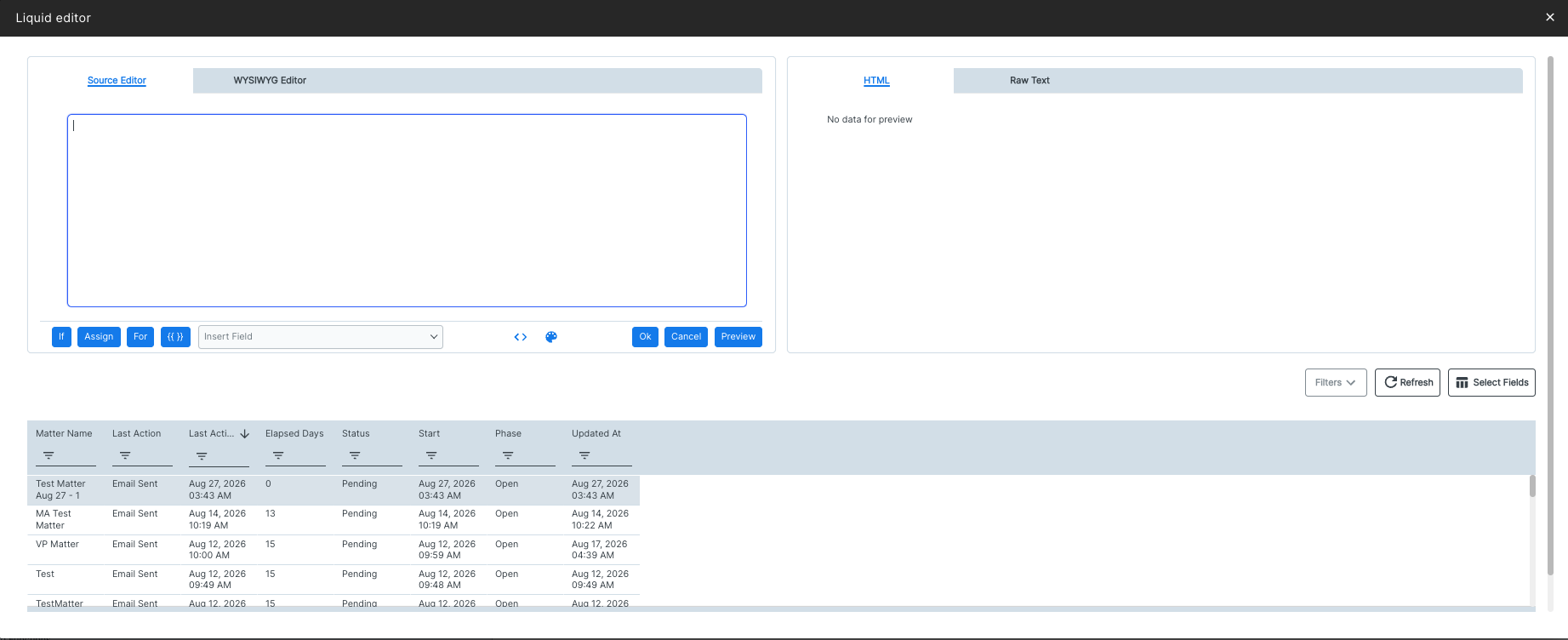
Click the Editor button on select fields to open the Liquid Editor console.
After clicking Save, the new Summary widget will appear in the main Widget directory.
Here's what a new Summary widget would look like within an app:
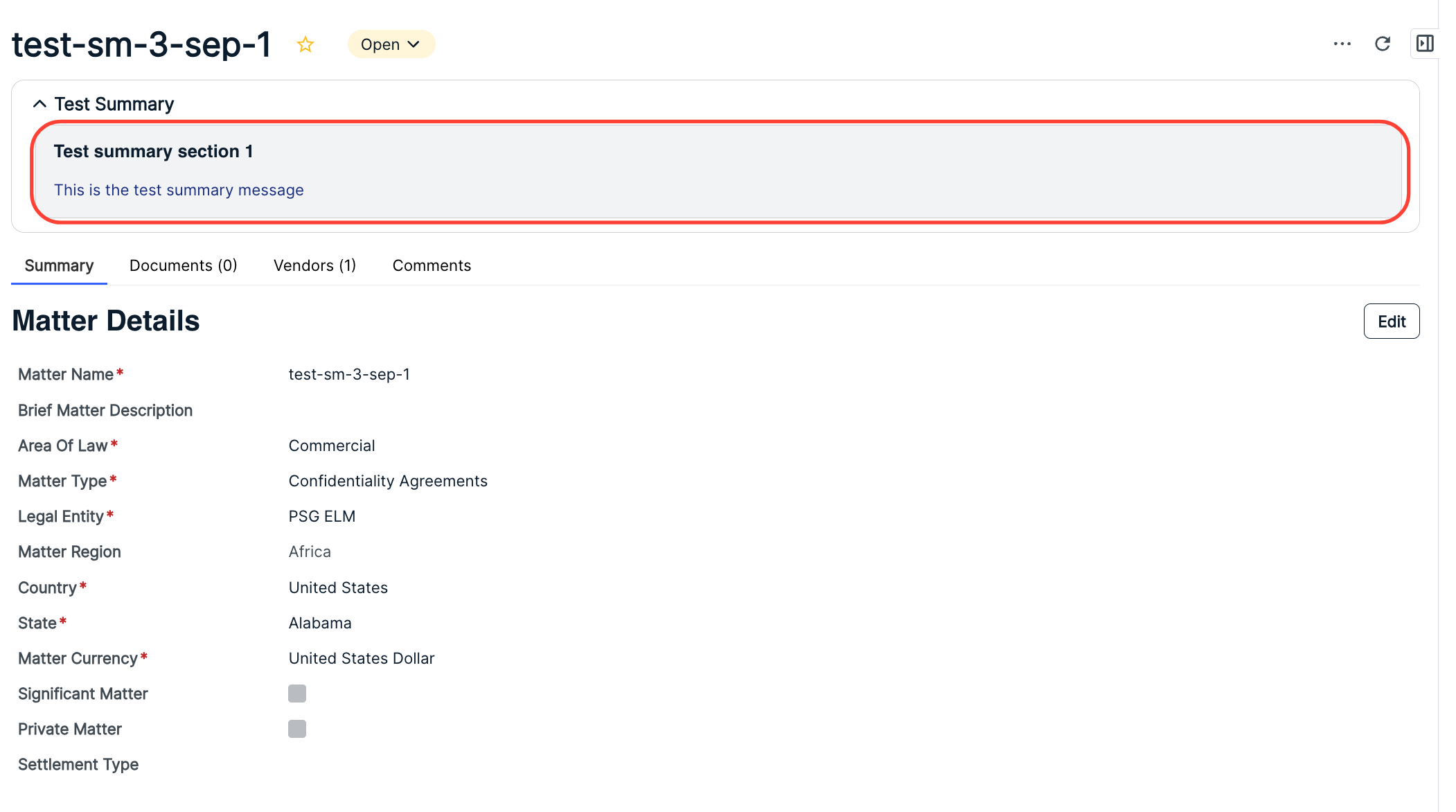
NOTE: Here is what all of these widgets look like on the same page.