Let’s think big picture for a moment! Any given Onit client might use our platform to solve between one and many dozens of different business problems. From tracking legal spend, to budgeting, to accruals, to expense reports the range is far and wide. As a result, an Onit environment might contain lots of different Apps and Records.
This is great news for the client as a whole, as it means that Onit is orchestrating their business and providing tons of value. For individual end-users, however, lots of Apps and data can be overwhelming to navigate. Ideally, each end-user will be presented with a UI that only shows them the Apps and Records that they actually care about, as well as charts and tables that spot trends and highlight their action items and key metrics. And that’s where Suites come in!
Suites act as a user’s Onit homepage, the first page that a user sees when they log in. On this homepage each end-user sees a curated collection of “widgets” that list and link to Records that a specific user cares about - for example, invoices pending the user’s approval or legal matters upon which the user is a Participant (click here to learn more about Onit's suite widgets). In addition, Suites provide a slide-out sidebar menu that gives the user access to a curated list of Apps, links, and reports that the user in question uses. As an App Builder Developer, you can create multiple Suites, one for each type of user (e.g., one Suite for attorneys and another for paralegals) and/or you can create different Suites for different business problems (e.g., one Suite for budgeting and another for accruals).
In this tutorial we’ll explain how to build and configure Suites.
Creating a Suite
- Navigate to the
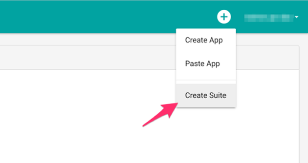
/appspage of your environment and click the “plus” icon in the upper-right corner of the page.

- From the dropdown select Create Suite.
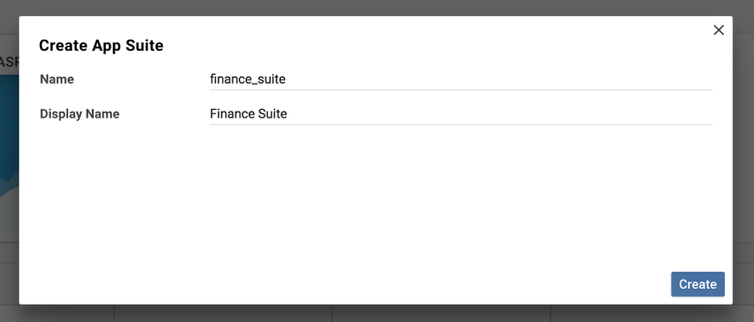
- Provide your Suite with a name and display name, and click Create.
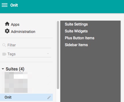
- You’ll be redirected to the Suite’s Advanced Designer page. You’ll use the many configuration options on this page to build your Suite.
Initial Suite Set Up
A Suite can only interact with Apps that have been explicitly added to it. By default, a new Suite has no Apps. Follow the steps below to add Apps to your Suite.
- Click the Suite Settings node in the Advanced Designer page.
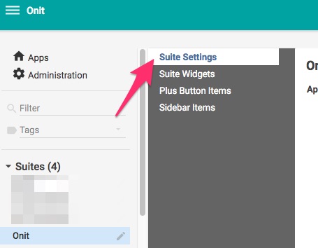
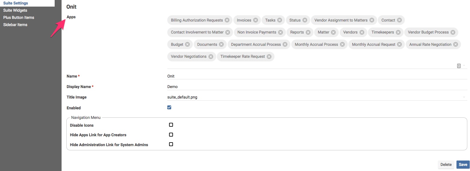
- Use the Apps property to assign Apps to the Suite.
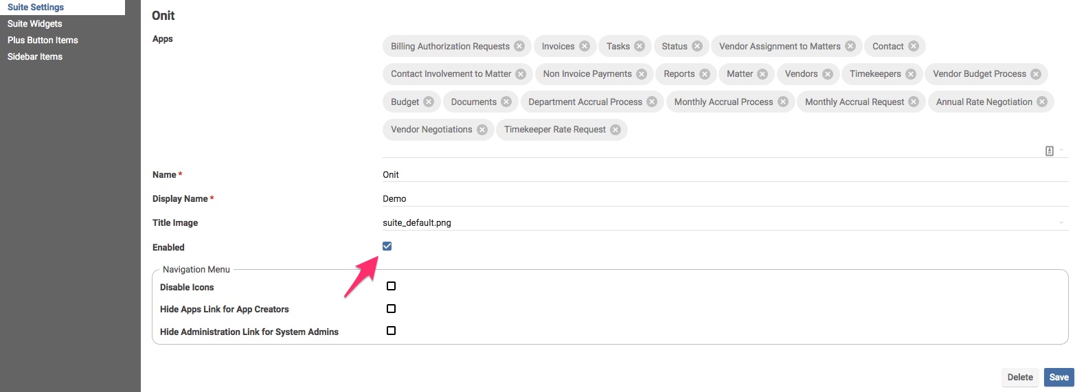
- By default, brand new Suites are not enabled - as a result they appear under the Inactive Suites header on the /apps page. You must enable your new Suite to use it.
Creating Sidebar Items
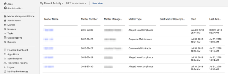
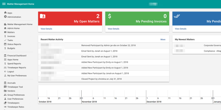
As mentioned earlier, a Suite contains a slide-out navigation list that end-users can leverage to move around their Onit environment (see the example screenshot below). Each item in the sidebar list is a clickable link.
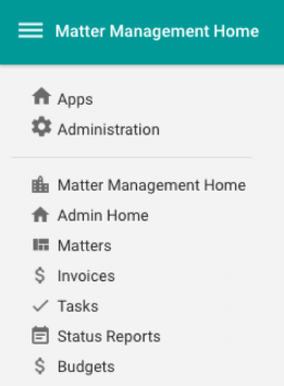
There are four types of items that you can add to slide-out sidebar list:
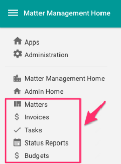
- App Link: A link to an App’s grid-based Dashboard. The sidebar items called out in the screenshot below are App Links.
- Dashboard: A link to Suite Dashboard.
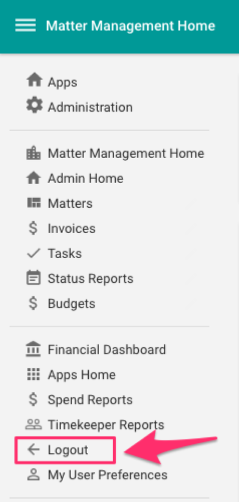
- Link: A link to a specified URL. In most cases, this is used to provide a link in Onit to a non-Onit website. For example, maybe a customer wants to provide Onit users with a quick link to their documentation management system. On the other hand, this is often used to provide a link to the Onit URL that forces a log out, which gives users a handy way to end their Onit session (see the example screenshot below).
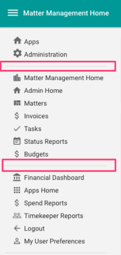
- Separator: When building a slide-out sidebar list, you can group navigation items together (e.g., all of the budget-related apps might be listed first, followed by a group of accrual-related apps). When you take this approach you can optionally insert separators between each group (as seen in the screenshot below). In order to do so you must first create separators in the Suite’s Advanced Designer page.
In the steps below, we’ll walk through the process of creating a few example sidebar items, just to get a feel for how this works.
Creating an App Link (Sidebar Item)
To create an App Link:
- Click Sidebar Items.
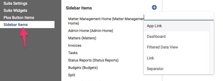
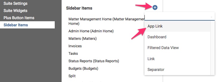
- Click the plus button then choose App Link.
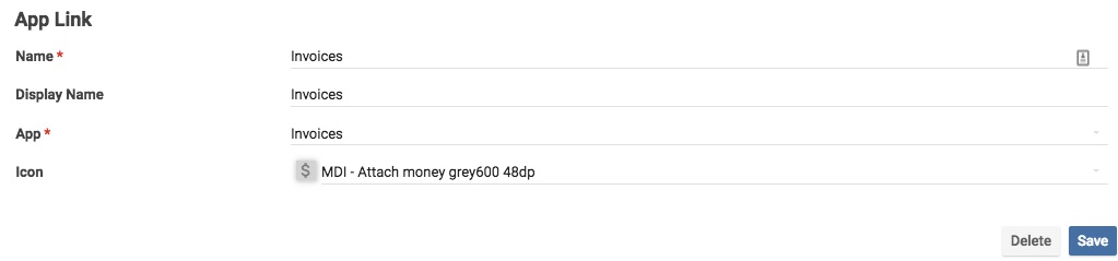
- The first navigation item link that we want available to users will be the Invoices App. Enter the following properties.
- Name: The item’s backend name (which will not appear to end-users).
- Display Name: The item’s display name. (The Name and Display Name can be the same)
- App: The App that this link will point to. Remember that you can only create navigation links to Apps that have been assigned to your Suite.
- Icon: The icon that will appear next to the navigation link in the navigation list.
Creating a Dashboard (Sidebar Item)
To create a Suite dashboard:
- Navigate to the Sidebar Items node in your Suite’s Advanced Designer page, click plus, and choose Dashboard.
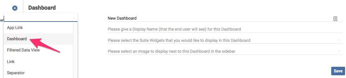
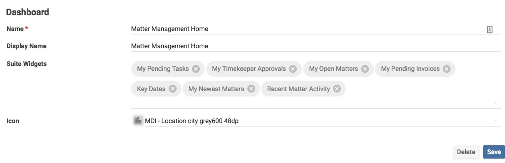
- Name your dashboard and choose the widgets that you would like to display on the dashboard in the Widgets property.
- Name: The dashboard name.
- Display Name: The name of the dashboard that users will see.
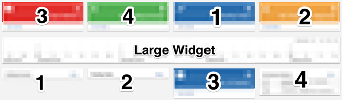
- Widgets: Widgets to be included in the dashboard. Widgets are ordered in a 3,4,1,2 order on the page. The widgets directly under a large sized widget will have the correct 1,2,3,4 order. We are actively working on resolving the widget ordering defect.
- Icon: The icon that will appear next to the navigation link in the navigation list.
- Click Save to save your changes.
Creating a Link (Sidebar Item)
To create a link:
- Navigate to the Sidebar Items node in your Suite’s Advanced Designer page, click plus, and choose Link.
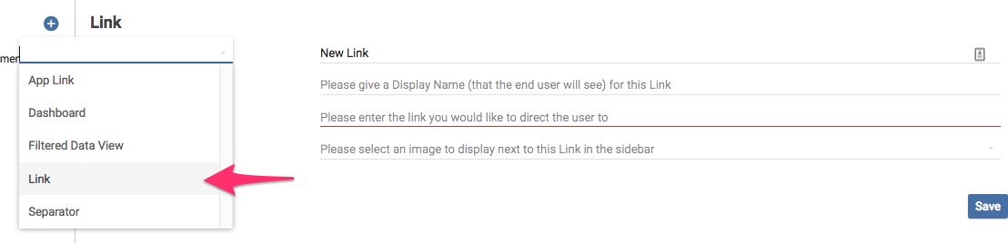
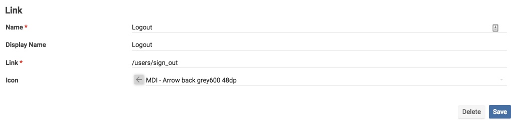
- We’ll create a link that point’s to the Onit environment’s log out page. Point the Link property to your environment’s
/users/sign_outendpoint.- Name: Link name.
- Display Name: Link name the end-users will see.
- Link: URL for the navigation item to point to.
- Icon: The icon that will appear next to the navigation link in the navigation list.
- Click Save to save your changes.
Creating a Separator (Sidebar Item)
To create a separator:
- Navigate to the Sidebar Items node in your Suite’s Advanced Designer page, click plus, and choose Separator.
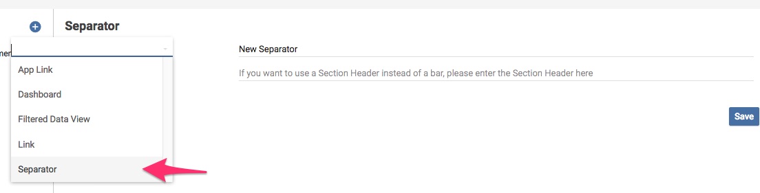
- Populate the following properties:
- Name: Name of the separator. Each separator must have a unique name.
- Section Header: Header that will be displayed under the separator (this is optional).

- Once you are done click Save.
Creating a Widget
Widget’s allow the App builder to customize the look and feel of a dashboard. They also provide users with helpful data comparisons and views that they would otherwise not have. A widget can only be displayed on a Suite dashboard.
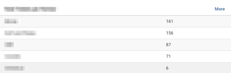
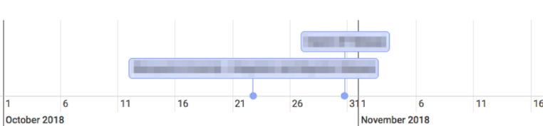
The following widgets are available:
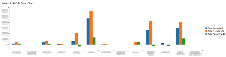
Series Chart
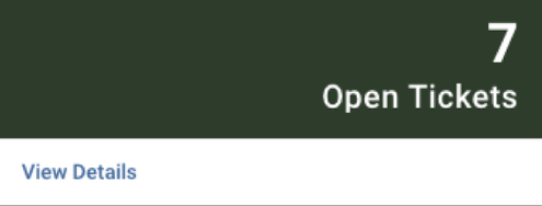
Counter
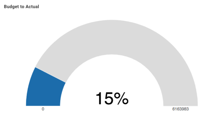
Gauge
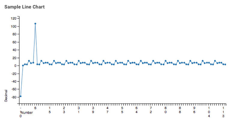
Line Chart
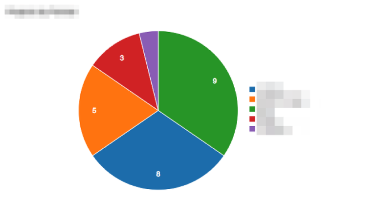
Pie Chart
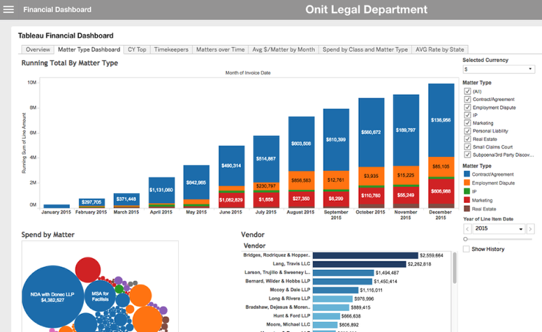
Portal

Report
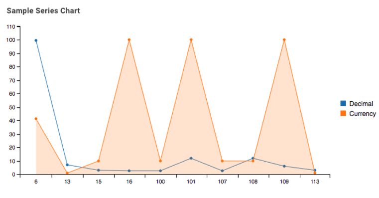
Series Chart
Table
Timeline
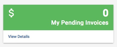
The specific configuration for each widget will be different. In this tutorial we will explain how to configure a Counter widget only, as an example.
- Navigate to the Suite Widgets node in the Suite’s Advanced Designer page.
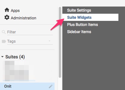
- Click the plus button then choose Counter.
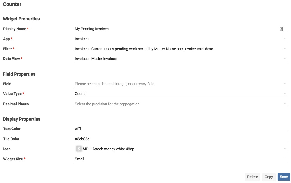
- Display Name: Display name of the widget.
- App: App that the counter widget will pull data from.
- Filter: Filter applied to data aggregated by the widget. For more information on how to create raw filters see this tutorial. For more information on the user_pending_work filter see this tutorial. This filter would ensure that a user only sees the count of Records requiring their attention on their widget, not the system total number of pending Records.
[{"type":"user_pending_work","user_id":"{{current_user._id}}"},{"operator":"like","value":"#!(Rejected|Approved|Closed|Complete)","property":"curr_state_name","type":"string"},{"type": "sorting", "sort": "created_at", "dir": "desc"}]
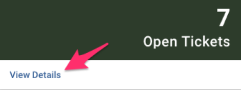
- Data View: An optional filter applied to data aggregated by the widget. If assigned, the data view will control which Records show up in the widget and how they appear to the user (e.g., column visibility and order when the user clicks “View Details”).
- Field: Field in the specified App the widget will aggregate data from. The aggregation field property can be left blank if the widget is counting Records returned from a filter. However, if the aggregation field is something other than the number of Records (e.g., total spending) fill in the Field name here (e.g., total_spend).
- Value Type: Count, Sum, or Average.
- Decimal Places: Number of digits to be shown after the decimal. Accepted settings are 0-6. The counter will round to the nearest unit and remove trailing zeros.
- Text Color: Optional. Color of the widget text, with the default being black.
- Tile Color: Optional. Color of the widget background, with the default being white.
- Icon: The icon that will appear next to the navigation link in the navigation list.
- Widget Size: Small, medium, or large. Widgets adhere to a 12-column layout: small widgets are 3 columns, medium are 6 columns, and large are 12 columns.
Creating Plus Button Items
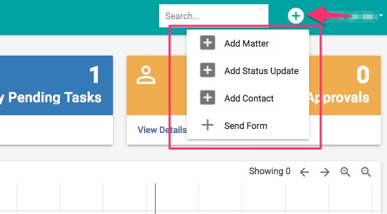
Plus button items refer to the dropdown list of actions a user can perform directly from the suite. For example in this suite users can create a new Matter Record, create a new Status Update Record, create a new Contact Record, or submit a form. Each one of these items launches a particular App.
To configure plus button items navigate to the Plus Button Items node in your Suite designer. The click the plus button and choose Launch App.
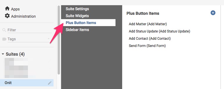
Fill in the following properties:
- Name: The name of the plus button.
- Display Name: The name of the plus button that will appear to users.
- App: App that the plus button action will launch (E.g., the Add Matter button will launch Matter)
- Icon: Icon that will display beside the plus button.
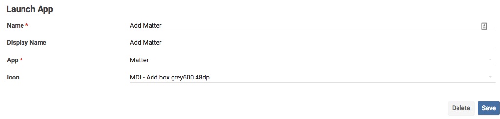
Click Save to save your changes.
Setting Colors
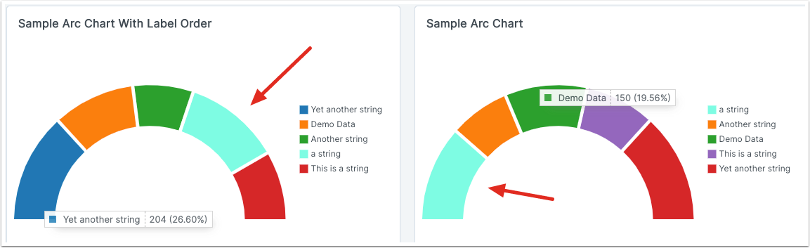
It's possible to force pie and arc chart slices to be a given color. For example, you could highlight invoices or contracts that are in a Disputed phase by making their pie slice colored red. Or you could make pie charts follow the colors used in a client's branding.
This is still a beta feature, so to use this you'll need to go to Administration, and under Corporation Details click the Beta Features node. Select "Color-coded Suite Visualizations".
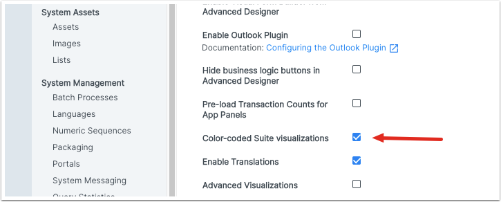
Now in the suite configuration page you will see a node for "Colors".
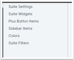
Click on "Colors" to see a list of already configured colors, with the usual + button icon to create a new one.
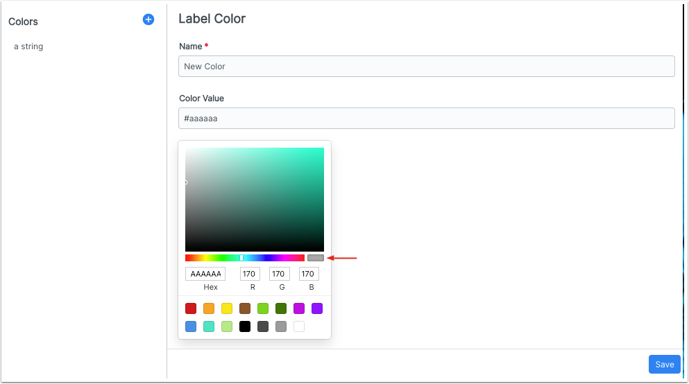
Under Name, put the chart label that will get this color. E.g., "Pending Invoice Approver 1" or "Disputed".
If you know your desired color's hex code, you can enter it directly into Color Value, or into the color picker window in the control labeled Hex.
If you know your color's RGB values, you can input those.
There is a variety of preset colors to choose from down at the bottom.
You can make a custom color by setting hue with the slider, then dragging the pointer in the window to set saturation and brightness. The small pane indicated above with an arrow shows you a preview.
Click Save, and now pie and arc chart slices will always have this color.
Suite Filters
Sometimes users want to apply extra filtering to suite dashboard widgets. With this configuration node, that becomes possible.
Click on Suite Filters. You'll see a list of the apps that are included in your suite. Click on an app name to bring up a list of Fields in the app.
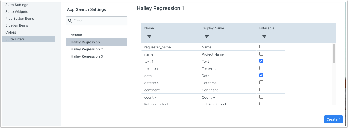
Select the Fields you want, then click Create. If you come back later to the same app configuration, the buttons here will be Save (to save any changes) and Delete (to clear all Field selections).
Once the suite filter has been created, users on a suite dashboard will see a header where they can set the filter.


Filtering uses the same controls as on an app dashboard grid column: e.g., text Field filters can be Exact or Contains and so on; number Fields will have Greater Than or Less Than; combo and listcombo fields will use the "simple" filtering.
Once a filter has been set, widgets affected by it will display a funnel-shaped icon.
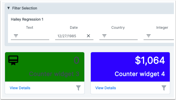
If you click through to a widget grid, the grid will be filtered according to the dashboard-level setting. This filter will not be visible on the grid itself; and if the data view includes a filter, even if you clear that filter or click "Clear all filters", the grid will continue to honor the dashboard-level filter.