Using Suite Widgets in Onit's Environments
Suite widgets are the building blocks of a Dashboard in AppBuilder. A dashboard is a navigation item on a suite made up of a grid of widgets, each pulling live data from an app (via a saved Filter or Data View) and rendering it as a chart, number, list, or embedded content. Widgets are configured once by an admin and then appear to every user who visits the dashboard, refreshed in real time against current data.
Every widget has a Name and Size (small / medium / large) — this is required on all types.
Below is each widget type, what it's for, and when to reach for it.
Counter
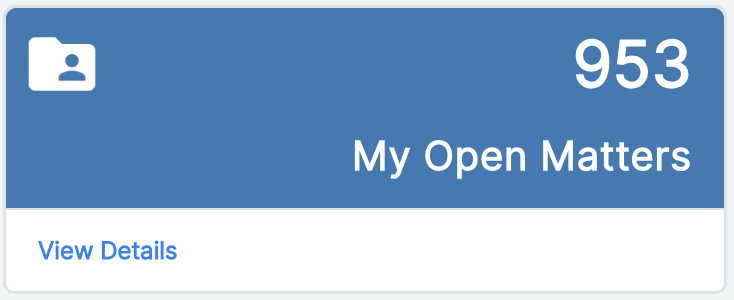
What it shows: A single large number — a count, sum, or average of a field across the records matched by the widget's data source.
Use it for: KPI tiles at the top of a dashboard — "Total Open Matters," "Total Spend This Quarter," "Average Days to Close." Anywhere you want one number to jump out at a glance.
Key fields:
aggregation_type— Count / Sum / Averageaggregation_field— the property to aggregate (for Sum/Average)decimal_places— precision for the displayed numbericon_image_path— optional icon shown alongside the numberforeground_color/background_color— tile theming
Bar Chart
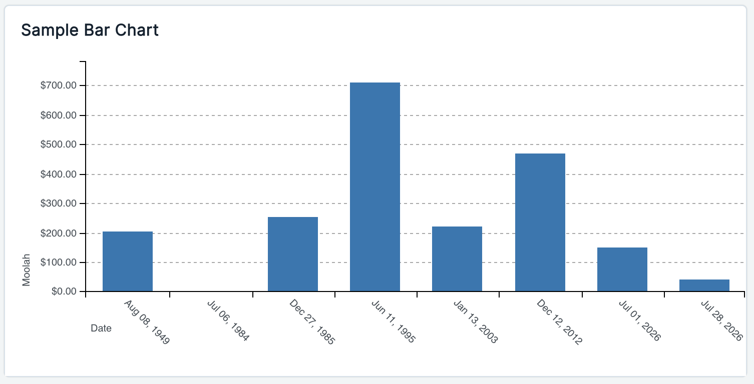
What it shows: Grouped vertical (or horizontal) bars comparing a metric across categories.
Use it for: Comparing volumes or totals across discrete groups — "Matters by Status," "Spend by Vendor," "Requests by Department." Best when categories are the main story and you want easy side-by-side comparison.
Key fields:
x_field/x_field_label— the category axisy_field/y_field_label— the measure axisy_field_renderer— Currency / Number formattingy_field_aggregation— Sum / Averagex_field_order— Alphabetical / Increasing / Decreasingx_label_rotate,x_y_rotate— layout/orientation options
Line Chart
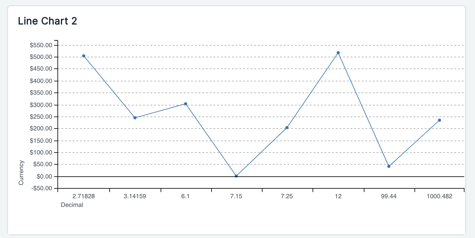
What it shows: A trend line connecting values over an ordered axis, typically time.
Use it for: Trends over time — "New Matters per Month," "Spend Over Time," "Open Tickets by Week." Choose this over a Bar Chart when the sequence/trajectory matters more than comparing discrete buckets.
Key fields:
x_field— usually a date/time propertyy_field— the measure being trackedy_field_renderer— Currency / Number formattingaggregate— Count / Sumx_label_rotate— axis label layout
Pie Chart
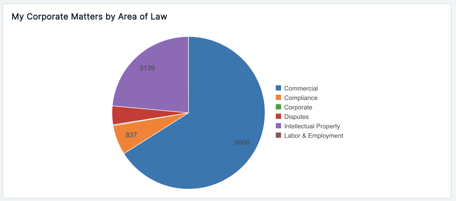
What it shows: A category's share of a whole, as pie or donut slices.
Use it for: Distribution/proportion questions — "Matters by Practice Area," "Budget Split by Category" — where the relative share of each category (not its exact trend or precise magnitude) is the point.
Key fields:
x_field— slice label (category)y_field— slice valuey_field_renderer— Currency / Number formattingdisplay_as_arc— donut vs. full piedisplay_legend,hide_labels— legend/label visibilitylabel_order— custom ordering of slices
Gauge
What it shows: A radial dial showing progress of a portion against a total (e.g., 65% complete).
Use it for: Progress-to-goal or utilization metrics — "Budget Used vs. Total Budget," "Tasks Completed vs. Total Tasks." When the total is unavailable/disabled, the widget gracefully shows "No Data" rather than a misleading dial.
Key fields:
total_field— the denominatorportion_field— the numeratortotal_field_renderer— Currency / Numberchart_type— Gauge / Radial stylechart_label,chart_unit_label— display text and units
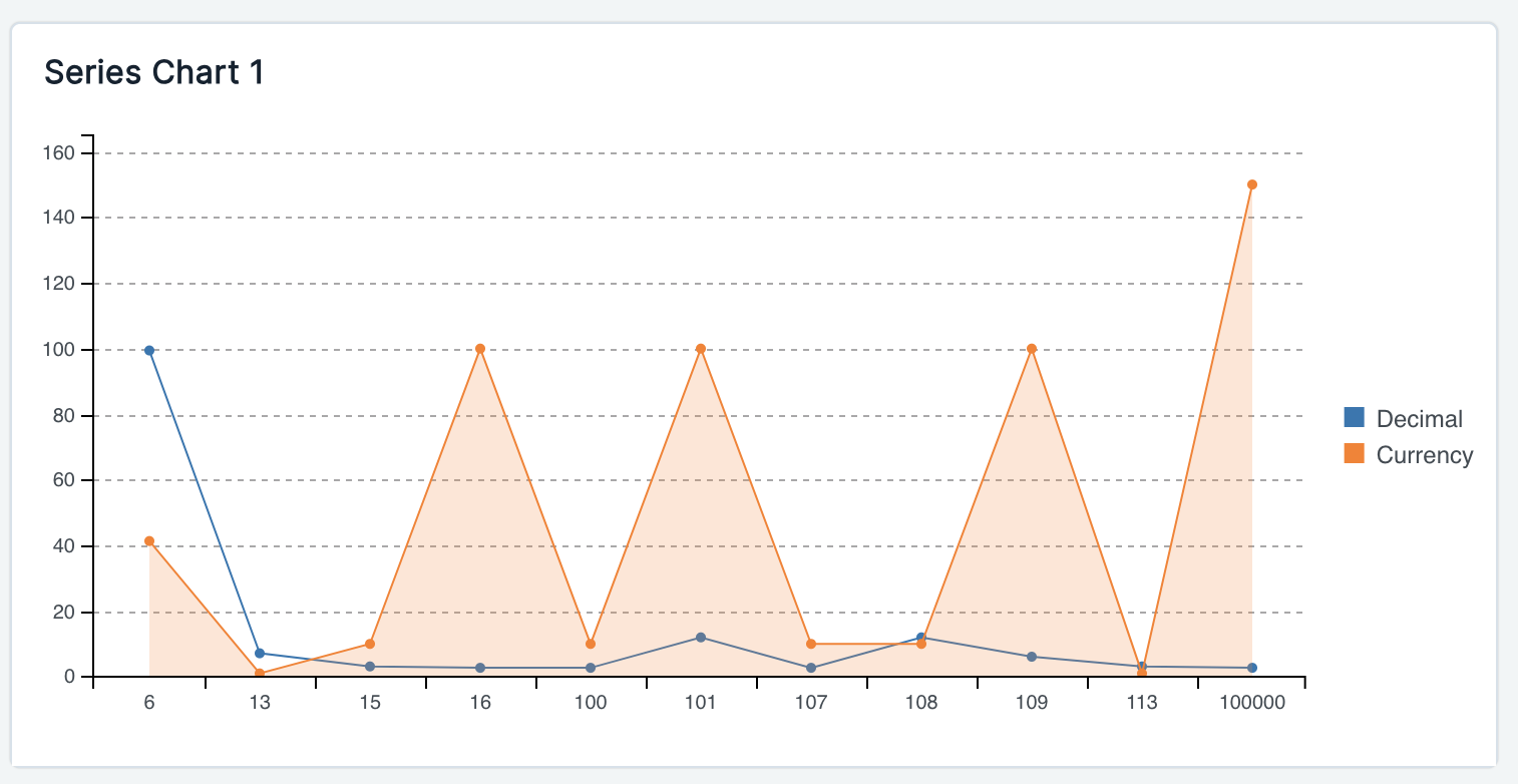
Series Chart
What it shows: Multiple data series overlaid on one chart, where each series can have its own chart type (bar, line, area, spline) — e.g., a bar series stacked with a line series for a running total.
Use it for: Comparisons that a single chart type can't express well — "Monthly Volume (bars) vs. Cumulative Total (line)," or comparing several measures side by side over the same category axis.
Key fields:
x_field/x_field_label— shared category/time axisseries_of— one or more series, each with its ownchart_type(Bar/Line/Area/Spline),y_field,y_field_label, andaggregate
Table
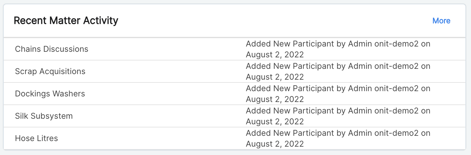
What it shows: A compact two-column list of records, each row linking back to the underlying record.
Use it for: A "recent items" or "top N" style list on a dashboard — "Latest Submitted Requests," "Top 10 Matters by Spend" — where users need to click through to the actual record rather than just see an aggregate.
Key fields:
left_column/right_column— properties (or built-ins likestatus,curr_state_name) shown per rowlimit— max rows displayedlink_type— View Atom (read-only view) or Edit Form (opens the record for editing)
Timeline
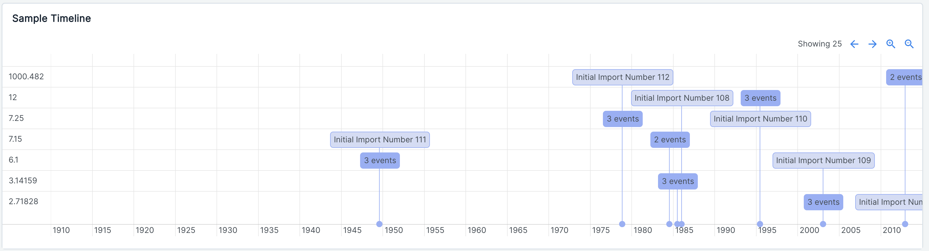
What it shows: Events plotted chronologically along a date axis, optionally grouped into rows/lanes.
Use it for: Visualizing schedules or chronological activity — "Contract Milestones," "Case Deadlines," "Project Phases" — especially when events have a start (and optionally an end) date and benefit from being grouped (e.g., by owner or type).
Key fields:
event_date(required) — start of the eventevent_end_date— optional end, for span-style eventsevent_name— label shown on the timelineevent_description— hover/tooltip textevent_group— groups events into lanesstart_date/end_date— bounds of the visible timeline window
Data View
What it shows: A full saved grid (columns, filters, sort, grouping) embedded directly on the dashboard — effectively a live mini record list.
Use it for: When users need more than a chart or a two-column table — a real working grid of records right on the dashboard, reusing a Data View that's already been saved and configured in an app.
Key fields:
data_view_id(required) — the saved data view to embed
Report
What it shows: An embedded external BI report (e.g., Tableau, Pyramid) that's been configured on an app.
Use it for: Surfacing existing BI/analytics reports alongside AppBuilder-native widgets on the same dashboard, without rebuilding that analysis as a chart widget.
Key fields:
report_id(required) — the app report to embedheight— embed height (default400px)
Iframe
What it shows: A plain embed of an arbitrary external URL.
Use it for: Pulling in external tools or pages that have nothing to do with AppBuilder's own data — a status page, an external knowledge base, a third-party tracker.
Key fields:
url(required) — the page to embed
Portal
What it shows: Custom HTML/Liquid content authored directly in the widget.
Use it for: Static or templated content that isn't a data visualization at all — announcements, welcome messages, instructions, links, or Liquid-templated text that pulls in dashboard/user context.
Key fields:
html(required) — HTML/Liquid markup, validated for correct Liquid syntax on save
Choosing a data source: Filter vs. Data View
Every chart-style widget (Counter, Bar Chart, Line Chart, Pie Chart, Gauge, Series Chart, Table, Timeline) is backed by either:
- A Filter — a saved
RawAtomFilterscoping which records to include, or - A Data View — a saved grid configuration (columns, filters, sort, grouping) on an app.
You can't use both on the same widget. As a rule of thumb: use a Filter for a simple record-matching condition, and use a Data View when you want the widget to stay in sync with a richer, already-configured saved view (including its grouping/sorting). Data View, Vega Viz, and Report widgets have their own dedicated source (data_view_id / vega_spec / report_id) instead.
Data freshness
Widget data is computed live at request time — there's no background pre-computation or caching layer to go stale. Every time a dashboard loads (or a dashboard filter changes), each widget's query re-runs against current records.
Deleting widgets and field dependencies
A widget can't be deleted while it's still referenced by a Dashboard navigation item — remove it from the dashboard first (visible via the widget's "Used In" panel in the editor). Most chart widgets also track a dependency on the app property they reference: deleting or renaming a property that a widget depends on is blocked (or flagged) so dashboards don't silently break.
Widgets to Know
Next, we'll outline some of the basic widgets to know across Onit's environments.
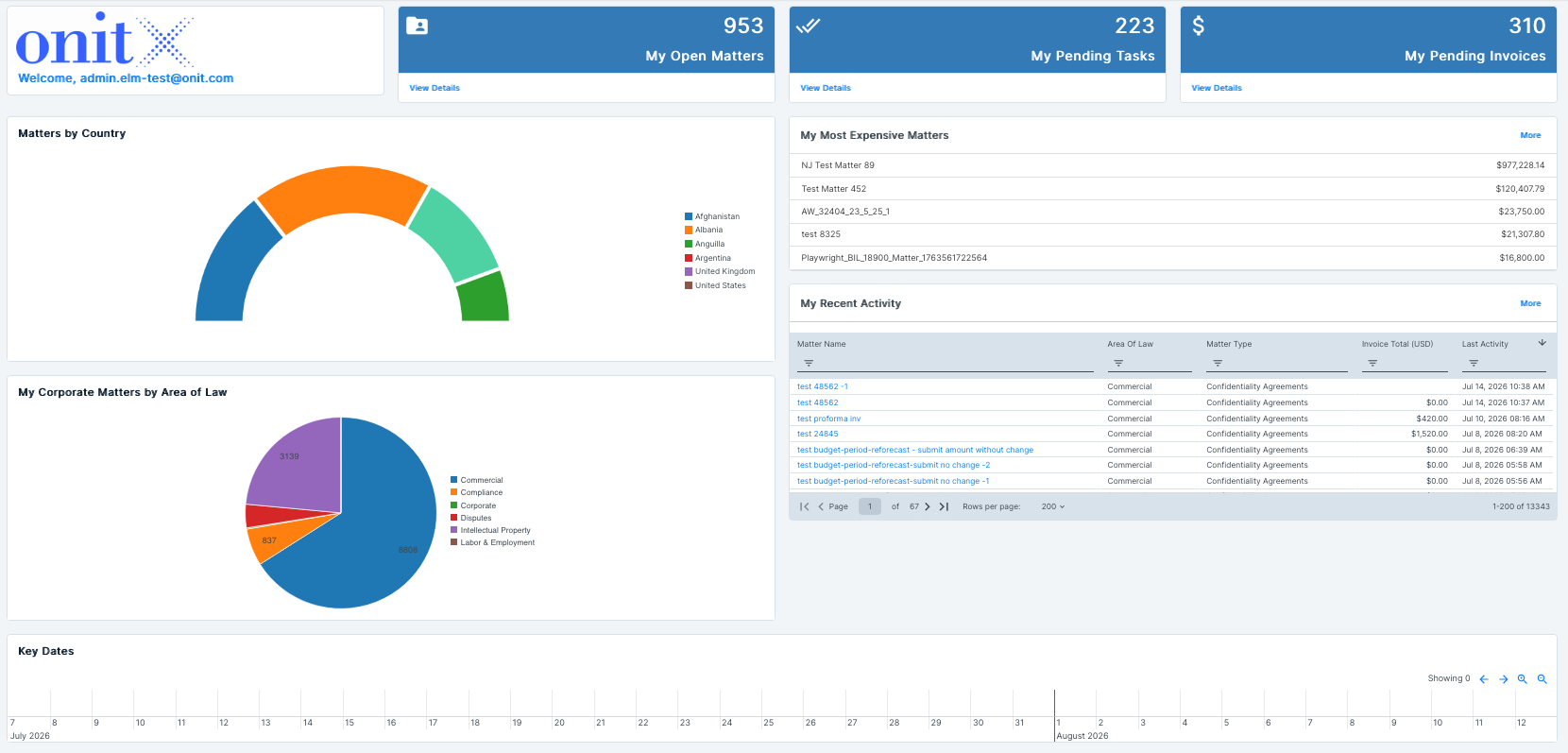
ELM
- My Open Matters: A KPI counter showing the total number of active legal matters assigned to or owned by the user. "View Details" drills into the user’s matter list. Use case: quick gauge of current workload volume.
- My Pending Tasks: KPI counter for outstanding tasks assigned to the user across all matters. "View Details" drills into the user’s full task list. Use case: helps the user prioritize action items needing attention.
- My Pending Invoices: KPI counter for invoices awaiting review/approval by the user. "View Details" drills into the user’s pending invoice list. Use case: flags invoices that needs the user’s attention.
- Matters by Country: A donut/arc chart breaking down matters geographically. Use case: useful for legal ops or compliance to see geographic spread/risk concentration of matters — relevant for jurisdictional reporting.
- My Corporate Matters by Area of Law: A pie chart segmenting matters by practice area, with counts per slice. Use case: helps identify where legal workload is concentrated by practice area, useful for resourcing/staffing decisions.
- My Most Expensive Matters: A ranked list of matters sorted by cost/spend. Use case: quickly surfaces the highest-spend matters for cost oversight, budget review, or further scrutiny.
- My Recent Activity: A sortable/filterable table of recently touched records in the system. Use case: a quick link so the user can see easily find records they recently viewed/worked on and jump back into the record.
- Key Dates: A horizontal timeline/calendar strip meant to surface upcoming key dates (deadlines, renewals, hearings, etc.) tied to matters. Use case: proactive deadline tracking so nothing critical is missed.
CLM
Post-Signature Dashboard
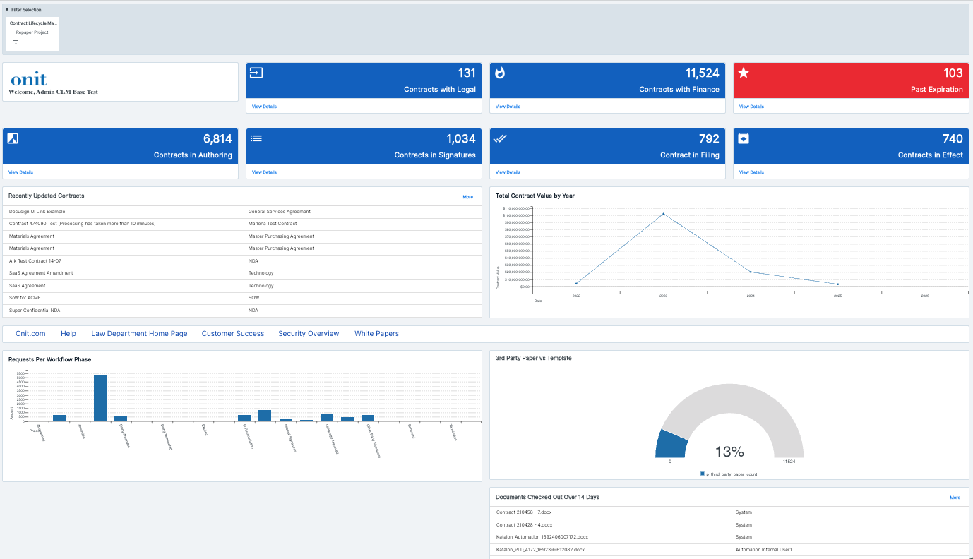
- Contracts with Legal (counter): Count of contracts currently sitting in legal review. Value: gives legal team leaders instant visibility into their queue depth so they can staff and prioritize review work before it becomes a signing bottleneck.
- Contracts with Finance (counter): Count of contracts currently in a finance-related phase (e.g., approval, pricing review). Value: helps finance and deal desk teams see the scale of contracts passing through them and spot volume trends that might warrant process changes.
- Past Expiration (counter): Count of contracts that have expired but likely need renewal, termination, or archiving action. Value: surfaces at-risk agreements immediately (red flag styling) so nothing lapses unnoticed, reducing compliance and revenue leakage risk.
- Contracts in Authoring (counter): Count of contracts currently being drafted. Value: shows how much volume is in the earliest stage of the pipeline, useful for capacity planning and forecasting downstream signature/finance load.
- Contracts in Signatures (counter): Count of contracts out for e-signature. Value: tracks how many deals are in the final execution stretch, helping ops teams follow up on stalled signature requests.
- Contract in Filing (counter): Count of contracts in the post-signature filing/archival step. Value: ensures signed agreements are being properly logged and stored, supporting recordkeeping and audit readiness.
- Contracts in Effect (counter): Count of currently active, executed contracts. Value: gives a real-time snapshot of the live contract portfolio size.
- Requests Per Workflow Phase (bar chart): Distribution of contract volume across every workflow stage (Authored, Amended, In Reconciliation, Signatures, Terminated, etc.). Value: pinpoints exactly where volume concentrates or bottlenecks in the end-to-end process, guiding process improvement efforts.
- 3rd Party Paper vs Template (gauge/donut chart): Share of contracts originating from third-party (counterparty) paper versus internal templates. Value: high third-party paper usage signals more negotiation/legal review overhead; tracking this ratio helps push more deals toward standardized templates to speed cycle time and reduce risk.
- Documents Checked Out Over 14 Days (data grid): List of documents that have been checked out for editing longer than two weeks, with the user holding them. Value: flags stalled edits or documents at risk of version-control conflicts, prompting follow-up before they become blockers.
- Recently Updated Contracts (data grid): Feed of the most recently modified contracts and their type (NDA, SOW, MPA, etc.). Value: gives users a quick pulse on active work across the team without needing to search or filter manually.
Total Contract Value by Year (line chart): Aggregate dollar value of contracts by year. Value: supports financial planning and trend analysis, showing whether contract value is growing, shrinking, or concentrated in a particular year — useful for leadership reporting.
Post-Signature Dashboard
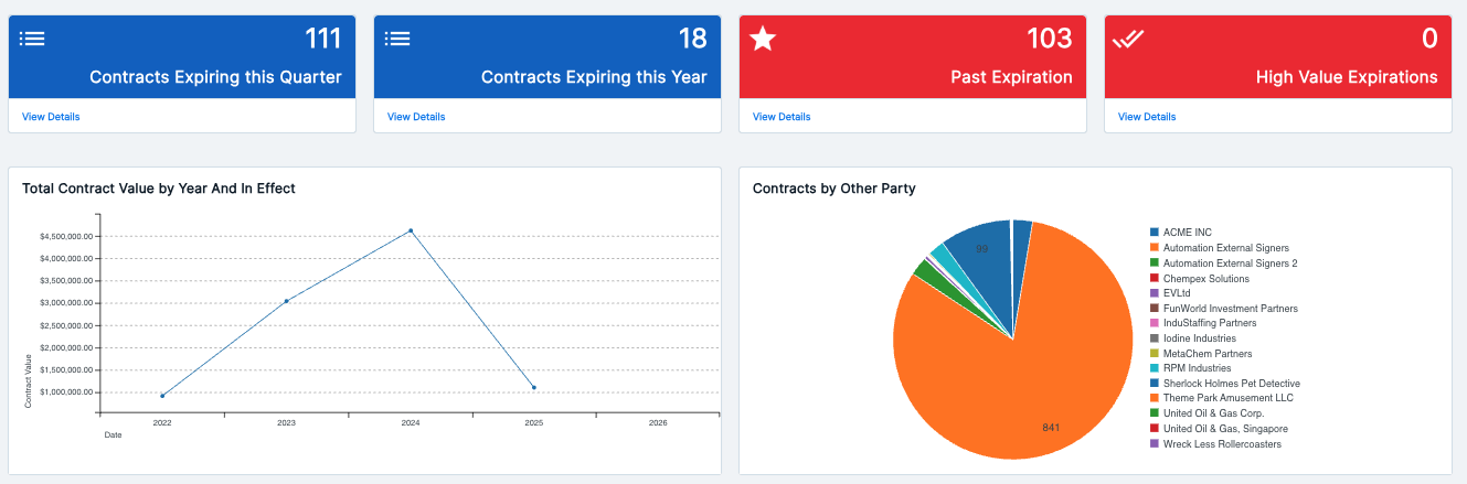
Contracts Expiring this Quarter (counter): Count of contracts set to expire in the current quarter. Value: gives renewal/CLM teams a near-term action list to prevent unplanned lapses.
Contracts Expiring this Year (counter): Count of contracts set to expire within the year. Value: supports longer-range renewal planning and staffing for the renewals team.
Past Expiration (counter): Count of contracts that have already expired without renewal or termination action. Value: flags overdue agreements (red styling) that need immediate attention to avoid operating on lapsed terms.
High Value Expirations (counter): Count of high-value contracts expiring soon or already expired. Value: prioritizes renewal attention toward the contracts with the greatest financial or strategic impact, rather than treating all expirations equally.
Total Contract Value by Year And In Effect (line chart): Aggregate dollar value of active, in-effect contracts by year. Value: tracks how much contract value is actually live versus just historical, supporting revenue and obligation forecasting.
Contracts by Other Party (pie chart): Breakdown of contract volume by counterparty/other party name. Value: shows concentration risk or relationship volume with specific external parties, useful for account management and vendor/customer risk review.
Repaper Dashboard
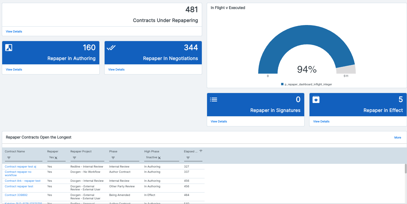
Contracts Under Repapering (counter): Count of active contracts currently going through a repapering process (renegotiation/reissuance). Value: gives contract ops leaders a top-line view of how much of the portfolio is mid-repaper, useful for resourcing and prioritization.
Repaper in Authoring (counter): Count of repapering contracts currently in the drafting stage. Value: shows how much repaper volume is just entering the pipeline, helping forecast downstream negotiation and signature load.
Repaper in Negotiations (counter): Count of repapering contracts currently under negotiation. Value: highlights where repaper volume is concentrated, flagging a stage that often causes cycle-time delays.
In Flight v Executed (gauge/donut chart): Percentage of repaper contracts that have been executed versus those still in flight. Value: gives a quick health check on repaper program completion rate, useful for tracking progress toward closing out a batch repapering initiative.
Repaper in Signatures (counter): Count of repapering contracts out for signature. Value: tracks how many repapers are in the final execution step, helping ops follow up on anything stalled.
Repaper in Effect (counter): Count of repapering contracts that have been fully executed and are now active. Value: confirms how many repapers have successfully closed out, useful for measuring program completion.'
Repaper Contracts Open the Longest (data grid): Filterable/sortable table of repaper contracts with project, phase, and elapsed days open. Value: surfaces the specific contracts stuck longest in the repaper process so owners can intervene on stalled deals before they become compliance or relationship risks.
Risk Analysis Dashboard
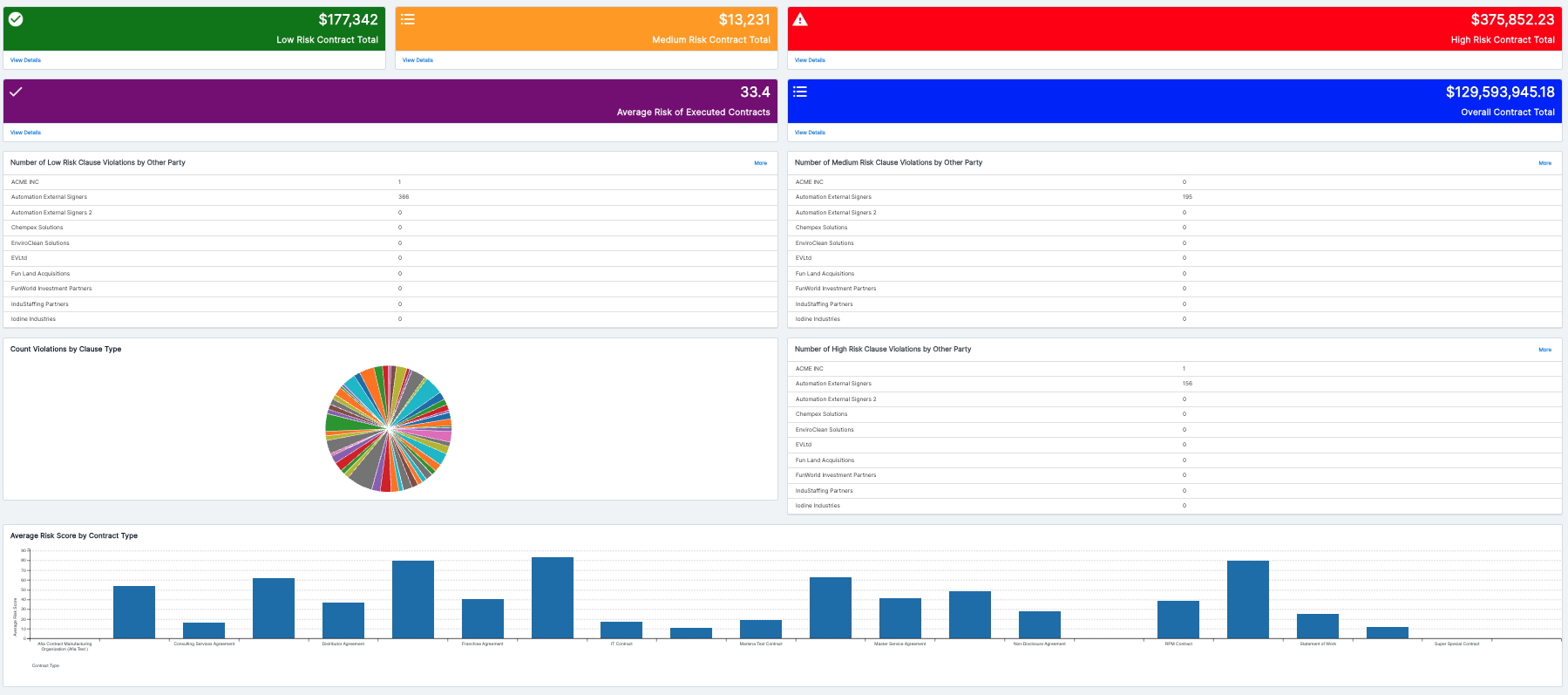
Low Risk Contract Total (counter): Aggregate dollar value of contracts classified as low risk. Value: shows how much of the portfolio's value sits in the "safe" bucket, giving a quick baseline for overall risk exposure.
Medium Risk Contract Total (counter): Aggregate dollar value of contracts classified as medium risk. Value: flags the portion of contract value that may need monitoring or periodic review, without demanding urgent action.
High Risk Contract Total (counter): Aggregate dollar value of contracts classified as high risk. Value: highlights the dollar exposure sitting in the riskiest agreements, helping legal and risk teams prioritize where to focus mitigation efforts first.
Average Risk of Executed Contracts (counter): Average risk score across all executed contracts. Value: gives a single trendable number for overall portfolio risk health, useful for tracking whether risk posture is improving or worsening over time.
Overall Contract Total (counter): Total dollar value across the entire contract portfolio. Value: provides the denominator for all the risk-tier breakdowns above, so stakeholders can see what percentage of total value is high/medium/low risk.
Number of Low Risk Clause Violations by Other Party (data grid): Table of low-risk clause violation counts broken out by counterparty. Value: lets risk and legal teams see which external parties are associated with minor clause deviations, useful for pattern-spotting without triggering escalation.
Number of Medium Risk Clause Violations by Other Party (data grid): Table of medium-risk clause violation counts by counterparty. Value: identifies counterparties trending toward more significant violations, supporting proactive relationship or contract management before issues escalate.
Count Violations by Clause Type (pie chart): Breakdown of all clause violations by the type of clause involved. Value: reveals which clause categories (e.g., indemnification, liability caps, termination) are most frequently violated, informing where playbook or template language needs tightening.
Number of High Risk Clause Violations by Other Party (data grid): Table of high-risk clause violation counts by counterparty. Value: pinpoints exactly which external parties are driving the most serious risk exposure, enabling targeted legal follow-up or renegotiation.
Average Risk Score by Contract Type (bar chart): Average risk score segmented by contract type (NDA, MSA, SOW, Franchise Agreement, etc.). Value: shows which contract types carry systematically higher risk, helping legal prioritize template revisions or added review steps for the riskiest categories.
Legal Holds
Click here for an overview of the Legal Holds dashboard.